


NEW LESSONS IN LANDSCAPE PAINTING:
Key Concepts and Exercises in Color and Composition
Available Oct. 13, 2026
The third and final volume in my 3-book series, featuring new topics, exercises, and demonstrations not covered in either of my two previous books. With over 100 paintings by 54 artists. Contents, reviews, videos, and sample pages ››
Order your copy: Amazon | Barnes & Noble
 Regular visitors to my blog will be familiar with the paintings from my Azure & Asphalt series. Over the past eight years, these paintings have been featured in several posts on this blog about composition and color. Yet, with over 45 paintings in the series, perhaps the most obvious lesson they offer relates to working in series. How can one paint the same subject, again and again, and keep the work fresh and alive?
Also see: Landscape Painting: Working in Series with “Rooftops”
Keeping it Interesting: Visual Theme and Color Strategies
The key to keeping an ongoing series interesting is to have a strong visual theme. In Azure & Asphalt, that theme it is the patterns of light and color that form on the water, streets, and rooftops at sunset. The elements of the subject — the water, streets, and rooftops — are embedded within the theme, but the theme of the series is really about the aesthetics of light and pattern. In other words, the subject is just a vehicle for me to play with certain aesthetics.
When I started the Azure & Asphalt series, I had no idea that I would do over 45 paintings, large and small, in both oil and pastel. The location was close to home, so I could revisit it each summer, paint from life, or capture photos in all different kinds of light. This gave me a lot options over the years, from which I could develop new approaches to the same theme. Over time, the series evolves. It builds on itself. You’ll discover new things in six months or a year from now that you can’t even conceive of at the outset.
When my focus is on aesthetics, the series stays more interesting — both for me and the viewer.
Working in series is also a great way to explore color. How many different ways can I interpret the light? Certain color families may repeat (like the azure blues in this series), but overall, each painting forms its own distinct color impression.
Repeating Elements
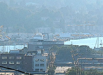
A digitally enhanced photo shows the foundational shapes of this viewpoint: the building, the ship canal, the sky, and the short vertical street in the foreground.
The examples in this post focus on one particular view that I have used in about half the paintings in the series. It includes a large building, a ship canal in the distance, the sky, and one small street entering vertically from the bottom. These four elements are the basis of each composition. What changes in each picture is how those elements are placed within the picture window. Sometimes the building and rooftops are placed low, with a lot of sky. Sometimes they are placed higher, with less area devoted to the sky. Sometimes I show more of the street, sometimes less. In some paintings, the hill along the back shoreline is also replaced by a sky, which gave me greater opportunity to merge the glare of the sky and the reflections in the water.
To convey the evolution of style and color, these works are presented in the order in which they were done. At times, the pastel work inspired me to try larger versions in oil. The colors also became more interpretive in the later examples.
Also see Painting Technique: How a Change in Medium Leads to a Change in Creative Expression.
Early Examples: 2015 –2022

High Road, Toward Sunset, 2015, oil on panel, 12 x 12″
Earlier paintings in the series relied more on direct observation, meaning the colors I used were, in large part, those I found in the subject or the photo reference. That’s why High Road, as well as Crossroads (below), have the noticeable blue tonality of atmospheric perspective.

Crossroads, 2015, oil on panel, 16 x 16″
Crossroads explores subtle temperature differences between the warm light of the sky and the cooler land masses. This piece also exemplifies the balance between simplification and detail I work with in these paintings: I had to include enough visual cues to make it clear to the viewer that it was an urban landscape, but few enough that they didn’t distract from my primary interest, which were the abstract patterns of light and color.
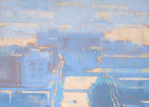
August Light in Azure and Orange 2018, pastel on paper, 4.75 x 6.75″
August Light is also dominated by the rich blues of atmospheric perspective, but the blue is now more saturated. The pale orange lights provide a strong temperate shift as well as a complementary reaction. Note the orange undertone, peeking through along some of the edges.

Triad in Azure and Orange, 2019, oil on panel, 12 x 17″
My success with August Light (above) led me to try a similar composition and color strategy in a larger oil.
Later Examples: Interpretive Color
As the series progressed, I became less interested in what I call ordinary light. I wanted to achieve greater luminosity and a sensation of glowing light. To do this, my color choices became more interpretive. The blues of the atmospheric perspective are replaced by warmer colors such as pinks, yellows, oranges, and red-violets.
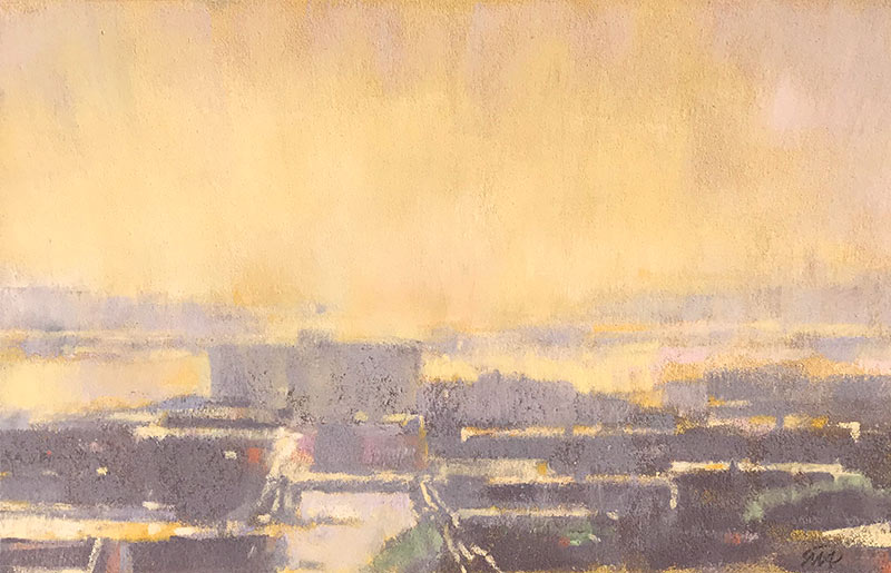
September Light, Salmon Bay, 2018, pastel on paper, 5.5 x 9″
At this stage, I am no longer dependent on direct observation. The color strategy is entirely invented and has little bearing on what colors I actually saw. In September Light, more saturated color is used in the sky, and the blue tones of the buildings are replaced with very neutral violets.
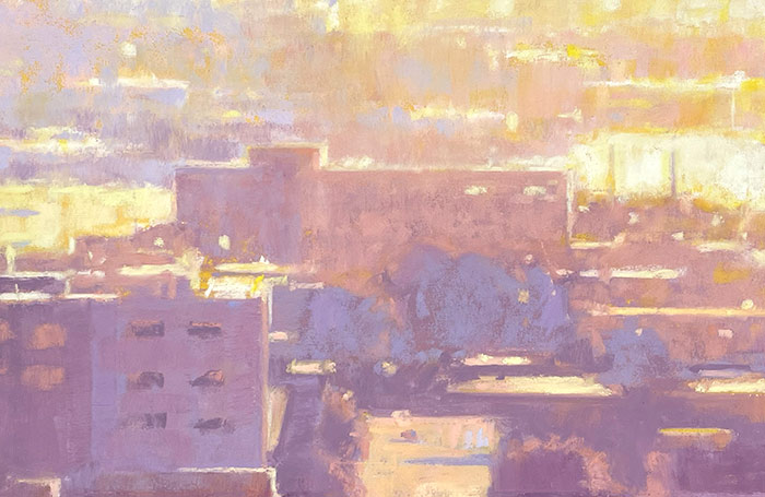
Old Ballard in Sunlight, pastel on paper, 5 x 7.5″
More invented color: the orange/red-violet complementary pairing serves as the primary color interation and stand-in for the radiance of brilliant sunlight.

Golden Triad, 2022, oil on panel, 10-¼ x 14″
The quality of light in Old Ballard in Sunlight (above), inspired me to try a similar color strategy in a larger oil painting. In this piece, however, I tried to use a more painterly and broken color quality, which for me is much harder to do with oil than with pastel. Broken color is a technique in which small strokes of color are placed side by side. These small strokes can optically mix when viewed from a distance. This can be seen in the upper area, where strokes of blue-violet and yellow-orange, of nearly the same value, are laid alongside each other. Lots of small strokes can also create a textural vibration.
Additional Examples, 2018 to present

On Golden Ground, Salmon Bay, 2018, pastel on paper, 5 x 7″
In another color experiment, I toned the surface with a gold ground. Then I laid my pastel colors over the gold, leaving it exposed in areas that I wanted to represent brilliant sunlight.
Also see Gold Gesso Ground as a “Metaphor of Light” in Landscape Painting.

Salmon Bay Under a Pink Light, 2021, pastel on paper, 4 x 5-¼”
In this small piece, I used subtler, more muted hues, but I played up the temperature differences between the pale blue in the sky and the pinks in the water and street.

Old Ballard Hardware, December, 2023, pastel on paper, 3-¾ x 6-½”
I often restrict my palette to two contrasting colors, as seen in the three previous examples. In this piece, I was intentionally trying to expand my palette. In addition to the dominant blue, I also introduced pink, green, and dark violet families. When incorporation this many color families, it’s important that they are not used in equal proportions.
 Ballard Hardware Building, Triadic, 2024, pastel on paper, 6 x 10″
This painting goes even further in expanding the color palette. It uses a triadic scheme, which combines red, yellow and blue primaries. These colors are as different from one another as any three colors can be, so one wouldn’t necessarily expect them to form a unified harmony. However, the trick to making a triaidic scheme work is to make sure the three families are not used in equal proportions. Here, yellow is by far the dominant family. Red is the second most used color, and blue is used least. Surprisingly (to me, anyway), these three colors (when ballanced properly) do an excellent job of suggesting light.
6 Comments
It works like a piece of research very interesting. One day I might stick to something long enough to get such rich insights … all the best – Dorothy
Hello Mitchell, I own both your landscape painting books. They have become my essential “ Go To”
books for landscape painting. Thank you for sharing your knowledge and technique so generously! – Ruthe Sholler
Thanks, Ruthie. I appreciate the kind words.
Working in series like this isn’t for everybody. But I can be very enlightening. Kind of like getting to know a friend over the course of many years.
I really like the idea of working in a series. I have been trying to move to abstract for several years; it’s very difficult. Came upon your web site which is very helpful. Thank you. Barbara
Thanks for the comments, Barbara. I have always worked in series and find that it suits my way of thinking. What you’ll find is that things will evolve as you go. What you thought you would be exploring in the first few paintings might be quite different than what you explore in the later works.