

 The “medium” we work in (oil, acrylic, pastel, gouache, etc.) is an extension of our creative expression. Each medium has certain properties and behaviors, limitations and advantages, which have a direct effect on our style. Water media behaves differently than dry media. And working wet-into-wet, wet-over-dry, or dry-over-dry (as we do with pastels) all produce different “sensations” and qualities.
Because of these differences, it stands to reason that when we change our medium, even if only as an experiment, we will see a shift in our thinking and a change in our creative expression or style.
Change your medium, change your thinking
I experienced this shift in thinking when I recently began experimenting with pastels. As an oil painter, I am intimately familiar with its physical properties. I can work wet-into-wet or wet-over-dry. Pastels, of course, are a dry medium. There is no “wet” and there is no drying time, so I am able to make changes more quickly than I can with oil. This allows me to achieve broken color more easily. Broken color is a painting technique in which small strokes of color are placed side by side. Depending on how it’s done, these small strokes appear to optically mix when viewed at a distance. At other times, the small dots and dashes create a textural vibration.
This change in thinking can be demonstrated with two nearly identical compositions, one done in oil and one done in pastel.
Example 1

Detail, Crossroads, oil on panel, 16 x 16 inches. This composition is nearly identical to the pastel painting below. In oil, working wet-into-wet or wet-over dry, I achieve a fairly soft and blended effect. This is well suited to suggest the thick atmospheric effect I am after. The oil is behaving like oil, and I allow it to.
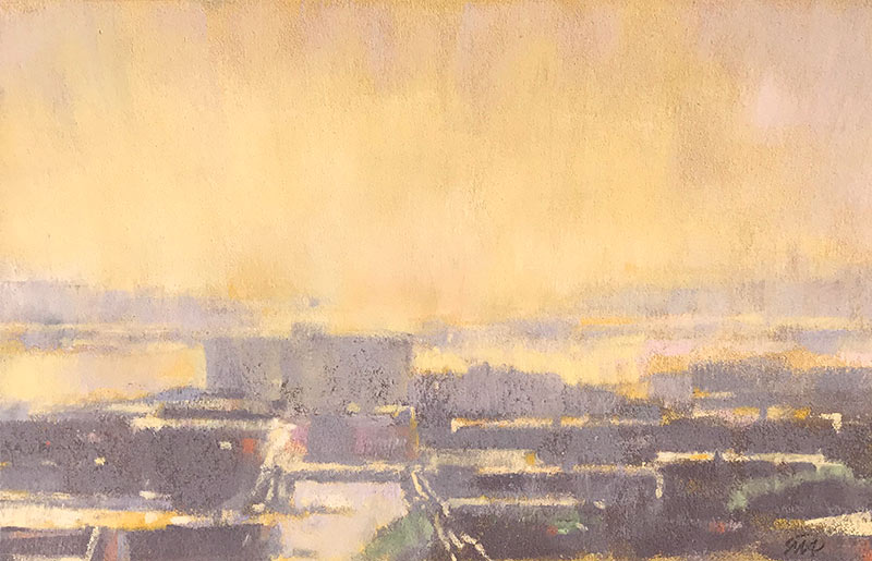
September Light, Salmon Bay, pastel on paper, 5-½ x 9 inches. In pastel, my marks and strokes have an entirely different feel. I can achieve broken color much more easily. Small dots and dashes and speckles of color produce a scintillating effect, which has its own way of suggesting light and atmosphere. Here also, I allow the pastel to behave like pastel. It would be difficult to get it to blend like oils, nor would I want to. By changing my medium, I am forced (in a good way) to think and paint differently.
Having been so delighted by the broken color I achieved with pastels, I am now more inspired to find ways to achieve broken color in oil paintings. The discoveries from one medium may inform the other.
Example 2

Above is a 7″ x 9″ detail from the 12″ x 12″ High Road Toward Sunset. Its effect is softer than what I get with pastel. Below, Old Ballard Hardware, December (pastel on paper, 3-¾ x 6-½”) has more texture and broken color. I initially stained the paper with an orange wash.
Urban landscape in pastel by Mitchell Albala
Example 3
Pastel allows me to generate more broken color, which is an effect I have always loved. When I experimented with watercolor a few years ago, it affected my creative expression in a different way. Letting the watercolor behave like watercolor encouraged me to loosen up. Below, Salmon Bay, High Noon (watercolor, 9″ x 9″) has freer and more expressive mark-making than many of my oils. The positive results I achieve with watercolor will perhaps encourage me to loosen up in my work with oils.
Of course, the point of all this is not to get you to abandon the medium you have spent years building proficiency with. If you are a watercolorist, you don’t have to become an oil painter, and if you are an oil painter, you don’t have to trade in your oils for pastels. But if you want to open new creative pathways, and possibly surprise yourself, then painting in another medium might be an experiment worth trying.
9 Comments
Dearest Mitch,
Welcome to the world of pure pigment in sticks. I’m so glad you are sharing the depth and refractive quality of the medium, as well as the instant gratification from a dry-on-dry approach. That watercolor is magnificent too! Your talent is obvious in your choice of any medium. Cheers! — Barbara Noonan
Thanks, Barb. I take that as high praise from a pastel artist of your stature! We all need a little more instant gratification with out art!
Inspiring and enlightening post! Looking forward to seeing more of your pastel/watercolors!
Hi Mitch … looks like you are definitely walking on the pastel side of the street now. Welcome to the wonderful world of pastel techniques and touches.
In addition to broken color… try to scumble and glaze some areas. That is fun also. We never made it through WA last summer… so did not get a chance to stop by to say Hi. Hope to do that another time. Hope you are well and have a wonderful holiday season. – Sharon
Hi Mitch – Your pastel paintings are wonderful. It is an amazing medium. I worked exclusively with pastel for 13 years mainly plein air. Nothing like it. Drawbacks – must frame with glass. And very large paintings are monstrously heavy due to glass and strong frames.
But I’m about to return to the medium to continue with plein air sky paintings.
You mention adding pastel to your oil paintings. Will you be able to “fix” the pastel? or will pastel seep into the oil so you won’t have to add fixative? Let me know what you find, please.
No, I did not mean that I would add pastels to my oil paintings. I don’t think that would work! I meant that the broken color I achieved with pastels might inspire me to try more broken color with oils.
Well, I’ve got one leg on the pastel side of the street, and one leg on the oil side. But I will primarily remain an oil painter. But I will continue to play in pastel!
Enjoyed your post. I have former experience with watercolor and pastel. I achieve broken color in my oil paintings by creating an underpainting in one color/value combination where the values are the desired final values but the colors are complements in areas where I want strong vibration and companion colors where I want a more muted effect. I let the underlying layer dry completely in the studio or create it with acrylics en Plein Air. I use a palette knife to apply the second layer because it allows random dots/streaks of the first layer to show through.
Thanks for the comment, Ken. I took a look at your work and see the effect you are talking about. You’ve carved out a nice methodology that works for you. I can see the telltale red peeking though in may places. Color on!