 I’m happy to announce that my pastel painting, Ballard Bridge, North Pier, received a Juror’s Award in the Northwest Pastel Society’s 37th International Open Show.
At the awards ceremony on April 29th, juror Liz Haywood-Sullivan said the following about Ballard Bridge:
“There’s amazing detail implied — but not drawn — in this atmospheric painting. The limited palette of pinks and purples captures a fleeting moment in time. The implication here is that of an incredibly busy scene … and yet there’s very little there. It’s masterfully handled …”
See all the show entries and additional winners.
Scroll down to see my notes on shape interpretation and color choices.
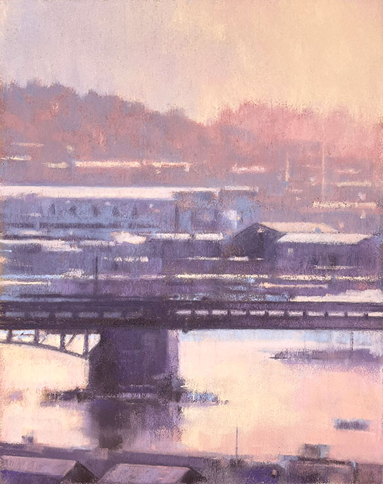
Ballard Bridge, North Pier
This piece is available for purchase for $850 USD. Please email me with your interest.
Ballard Bridge, North Pier, 2023, pastel on paper, 10 x 8″
Shape Interpretation
Ballard Bridge, North Pier is one of many paintings from my Azure & Asphalt series. These works explore the abstract patterns of light on water, streets, and rooftops at sunset. As juror Liz Haywood-Sullivan observed, these works strike a delicate balance between description and implication. They have to include enough visual cues to make it clear to the viewer that it is an urban landscape, but few enough that it doesn’t distract from my primary interests, which are the abstract patterns and the light.
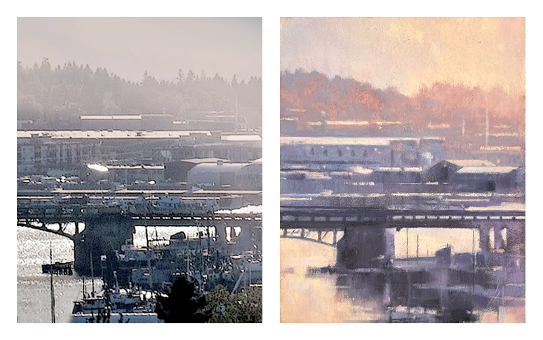 In the original scene (above, left), there was a mishmash of boats in the lower right corner. There was also little value differentiation there, which made deciphering the shapes even more difficult. Separation of values is key to defining shapes. I tried to imply all that clutter with a few simplified shapes without rendering every detail (right). But shapes and forms — even those that are implied — need to make structural sense.
My solution was to wipe out that area and add a strip of foreground buildings at the very bottom. Without that foreground to anchor the bottom of the picture, the water would have felt too open and empty.
Borrowing My Own Color Strategy
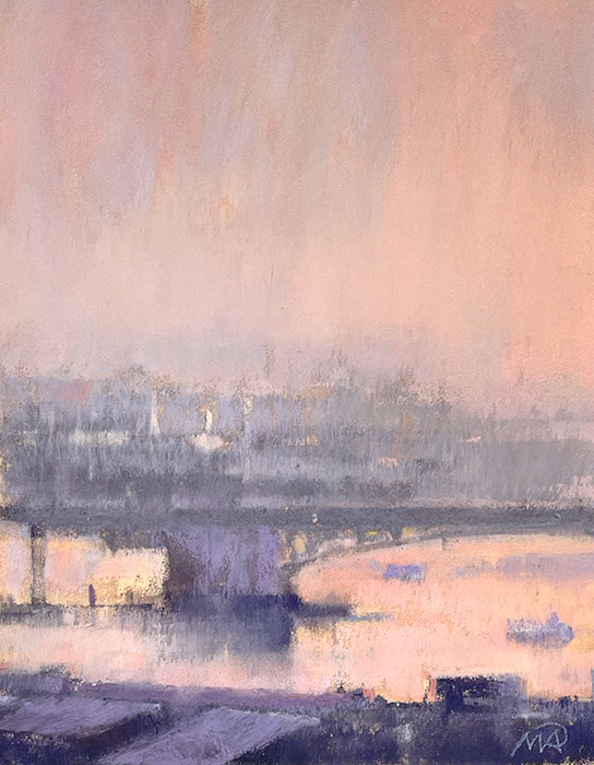
South Pier, Ballard Bridge, pastel on paper, 6 x 4-¾”. Collection of Loriann Signori.
The source image was quite colorless, almost entirely black and white. I rarely depend on the colors I see in the source photo. I prefer to build my own color strategy. This blue-violet and pink combination had worked well in South Pier, Ballard Bridge (above), so I applied a similar strategy here.
A successful painting has to work on every level. It can’t have great color but weak composition. Or great composition but poor shape interpretation. Color, composition, and shape interpretation all have to work together.
See additional pastels from my collection.
2 Comments
Congratulations, Mitch. Well deserved! It is a gorgeous piece. Love, Jennifer
It’s a beautiful painting that oozes poetry. How wonderful when another highly respected artist sees (and feels) your intentions. I am delighted to own the first version.