Many of my landscape painting students work with photos. We spend a lot of time analyzing how well the photo will translate into a painting up. Does the photo include too much information or lack vital cues such as volume and differentiated shapes?
Also see The Landscape Painter’s Guide to Selecting Reference Photos.
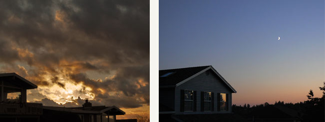
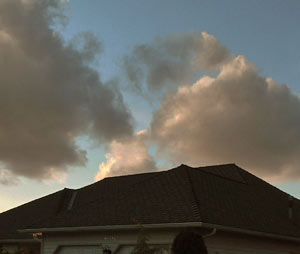
One student asks, I have been sitting on an idea for a few years, a ‘rooftop series’ that came out of the strange over-hanging clouds just touching the rooftop lines … I love the opposites of the straight, organized lines with the chaos of the weather. I have enclosed a few worked-up compositions, reworked from the photos. Let me know what you think. I want to do about 10 or 12 paintings.
My response:
These photos are a fine starting point. Unlike many photos we have reviewed in our critique group, the problem with these photos is that they are good and very captivating — and as such, a largely resolved visual problem unto themselves. So the question I would ask is: How will your treatment of this subject improve on the photos?

It sounds like you have already discovered an aesthetic event — “opposites of the straight organized lines with the chaos of the weather.” That is a really good place to begin. (Actually, it’s my favorite place to begin.) Yes, it’s about clouds and rooftops in the sunset — but, ah, the aesthetician knows that it’s much more than that!
That said, here are some things I would keep in mind:
Working in a series. You said that you hope to do 10 or 12 paintings. Doing that many subject-specific paintings can become quite a journey. Will you repeat the visual idea in only slightly different ways? Or will each painting solve a different aesthetic problem? My hope is that after completing a few paintings, you will come to know the subject in new and deeper ways … and feel compelled to go off on new tangents. In other words, don’t get locked into repeating the same idea in slightly different ways. Stay open to going down paths you never expected. Also see Landscape Painting: Working in Series with Rooftops.
 Working with dark values. As you know, darks are not just dark. They hold a color component, but to a lesser degree than we observe in middle or light values. When colors are as dark as they are in high contrast sunset images like these, it is much harder to see, and then assess the color than it is with lighter colors and values.
If memory serves, you have often relied on earth colors to help build your darks and/or shadows. Here I would suggest that you try to create your darks with more chromatic mixes made from pigments like phthalo blue, alizarin crimson, viridian, phthalo green, and ultramarine, etc. This may help you interpret the darks in terms of color, as opposed to just dark value. Using a dark pigment like, say, burnt umber, would be effective for creating the neutral component of a dark shadow, but it doesn’t register color as much as the above mentioned pigments. Of course, you have to test all this on the battlefield that is your palette! I’ve done a series of nocturnes which were quite challenging for this reason.
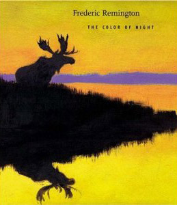
 I did a series of nocturnes and I found inspiration in Whistler’s night scenes and in Frederic Remington’s nocturnes, which can be found in the book Frederic Remington: The Color of Night (great title!) by Nancy K. Anderson.
Composing with silhouetted subjects. These photos have enough allure on their own that many painters might reference with the photo as is … and overlook less obvious issues of composition. But since you are pursuing a visual aesthetic that, by your own definition, is about “opposites of the straight organized lines with the chaos of the weather,” you will have to continue thinking in these aesthetic terms.
In sunset scenes like these, major shapes are transformed into silhouettes. Because the rooftops have no clear light-side and shadow-side, the essential cues for volume are lost. This means that you will be composing with largely flat shapes. In collage like fashion, you must ask yourself how the major shapes of the composition will fit together to create a layered space.
Here the subject is reduced to just two zones — the near rooftop and the distant sky. Thus, the shape of that rooftop and how it overlaps the sky will be of great importance. What proportion of the canvas will be devoted to the sky? What proportion to the house and the rooftop? Although they are separate zones, near and far, how will the sky and rooftop zones integrate, like two giant puzzle pieces? We’ve talked a lot about how big, simple shapes and value zones have a way of resonating with the viewer, and have cited Marc Bohne’s work as an example. Your series is shaping up (pun intended) to be a great vehicle to prove that yet again!
I suggest some compositional studies, by hand, in strictly notan style, so you can readily see (and change if necessary) the relationship between the foreground and background. I see some potential areas where a little trimming might be in order. I often ask myself: what is the least amount I can include here in order to accomplish my visual mission?
When a painter gets to a place where the composition is plastic — that is, flexible enough to be bent and shaped by their hand to suit their purpose — that is a great a day, as great as the day when they discover that the painting is not about narrative, but an “aesthetic event.”
Additional Resources
Landscape Painting: Essential Concepts and Techniques for Plein Air and Studio Practice
Subjects with Diminished Cues, page 78– 79
Mixing Rich Darks, page 144
Preparatory Work, pages 130–131
The Landscape Painter’s Guide to Selecting Reference Photos
Using Photographs Like an Artist
The Tyranny of Photo Reference in Landscape Painting
Convincing Color Relationships Between Sky and Ground in Landscape

1 Comment
What a great topic of discussion. Silhouettes in photos present us, as you said, with a flat shape, lacking depth and variation of color. This can be all right if, in addition to the “line versus chaos”, another aesthetic is found such as “flat versus dimensional”, or perhaps toying with how much of the painting is dominated by the interesting shapes presented. It also comes to mind that the artist can play with ways to break up the big flat shape, say with possible windows, doors or torn places in the building.
The other aspect that comes to mind is the ever popular debate on using photos in the first place! It is great to pick up on the graphic qualities but I would feel driven to make notes during the observation at the time of the photo to give me ideas and cues as to what part of the shadows expressed color to me. Obviously I’m writing from the viewpoint of a representational/impressionistic style painter; abstracted, the subject presents endless possibilities …. So, if this does turn into a series, a show, you have to let us know so we can come cheer this thoughtful artist on!