Photo: Carol Sandor
Note: If you have been directed to this post in advance of a workshop with me, be sure to read the section at the end: Tips on Preparing for My Workshops.
As digital photography and image editing apps have become more ubiquitous, painters are using photographic references more than ever. Of course, nothing replaces painting from life, and nothing should. (See The Gifts of Plein Air – Living Color through Direct Observation.) But photos do offer some very practical benefits. They allow us to work with subjects that we would otherwise not be able to access for any length of time, either because of safety concerns or extreme weather conditions. They can capture a fleeting moment in the form of a person or animal, or a short-lived atmospheric effect. They are also reliable reference for detail.
However, photographs also contain misleading and unreliable information. We have been so exposed to photographic imagery our whole lives (including moving images like TV, movies, and video), that we readily accept it as a faithful stand-in for reality. This makes it easy to overlook a photo’s flaws — things like overly dark or overly light values, or poorly differentiated shapes. We might be able to accept these flaws in a photo (because it looks so realistic) but if we carry that information into our paintings, our work will suffer.
In this guide, I’ll review the essential qualities to look for — and to avoid — in your reference photos. These guidelines are directed at finding shapes that are clear and readable. These guidelines also hold true when working from life, en plein air.
- Shape and Value Differentiation
- How the Direction of the Light Affects Differentiation
- Setting up the Spatial Stage
- Tips for taking Photos
- Tips on Preparing for My Workshops
Shape and Value Differentiation
Of the many faults a photo may have, a lack of differentiation is the most serious. Poor differentiation is usually the result of values being too close. When the values of shapes are too close, they tend to merge, and where they merge, we lose the ability to differentiate one shape from another. Because the photo is so sharp and captures hundreds of subtle value shifts, we think it’s clear. But trying to differentiate all those values in a painting will be next to impossible.
Photos with Poor Differentiation
POOR DIFFERENTIATION: Ex. 1
 Differentiation is achieved primarily through distinct value differences. When a photo has poor differentiation, you can hardly tell where one value ends and another begins. Shapes tend to glom together in large, undifferentiated masses. Squint at this photo and you’ll see that the entire hill and foreground brush is more or less one large value mass. Trying to pull out discernible and meaningful shapes from all this will be very difficult.
Beware of overcast and cloudy days. The photo above lacks differentiation, in part because it was taken on an overcast day. Cloudy conditions sometimes offer moody and atmospheric effects, but they also tend to diminish color and reduce value contrasts.
Also see Painting Overcast Scenes in Plein Air or in the Studio.
POOR DIFFERENTIATION: Ex. 2
 This photos is deceptively attractive. It’s a pretty scene with many luscious colors. But it lacks differentiation and focus. Yes, the value and color differences among the rocks and grasses define one shape from another — but only to a very small degree. The subject is a mish-mash of green and tan rock shapes with no focus. There’s little variation between large and small shapes, no clear patterns of light and shadow, and no separation between the foreground, midground, and background.
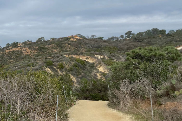
POOR DIFFERENTIATION: Ex. 3
 This photo is well exposed, without overly dark or overly light areas. But the differentiation is mixed. The sunlit hill in the upper left is well differentiated. You can clearly see the separation of the shapes and colors. But the lower half is not well differentiated. It is entirely in shadow. If you squint at that area, you can see that most of the values are very close. This can read well in a photograph, because it’s so realistic, but managing such closely related values in a painting will be difficult. This isn’t to say that you can’t have large areas of shadow in a painting, but if there is a lot going on in the shadows, and the values are very close, it will be much harder to articulate all those small differences in the painting.
POOR DIFFERENTIATION: Ex. 4
Light and shadow don’t correspond to actual forms. Scenes like this can be quite appealing. Here, over 90% of the subject is in shadow. A lot more dark than light in a composition is not necessarily a bad thing, but the problem is that the lights and darks don’t help define the actual forms. That, plus the fact that the values of those forms (trees, ground, and wall) are all the same, will make establishing differentiation in the painting extremely difficult.
POOR DIFFERENTIATION: Ex. 5

Undifferentiated “walls” of trees. Large, complex clusters of foliage or close-ups of trees can become an indistinguishable mass of foliage and limbs, especially when there are few other landscape elements to relate to. In real life (and in photos), scenes like this appear to be dimensional. But to create an illusion of space in a painting, there must be clear patterns of light and dark to define the tree’s structure. Relatively speaking, the tree in this example exists on one plane and will lack the near and far (spatial) cues we want in our paintings.
Photos with Good Differentiation
In this set of photos, you’ll see a big difference in the clarity of the shapes. Gone are all the ambiguous passages created by undifferentiated values. When you squint at these images, you’ll actually see the main shapes quite clearly. While there are plenty of details in these examples (as there usually are in landscapes), the main shapes remain clearly defined from one another.
GOOD DIFFERENTIATION: Ex. 1
 In the photo above, there is a lot of detail — tiny leaves and grasses — but overall, the main shapes are clearly defined from one another. In a well-differentiated photo, the shapes should be differentiated enough that you could outline each one with ease, as shown below. The shapes that are outlined are the major or dominant shapes, those that serve as the foundation of the composition, not the smaller details.

GOOD DIFFERENTIATION: Ex. 2
 This is a very well-differentiated subject. There are lots of clearly defined shapes, each one a specific value and a specific color. There is some complexity on the left in the foliage, but even those forms are divided into fairly clear patterns of light and shadow.
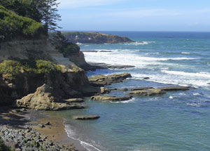
GOOD DIFFERENTIATION: Ex. 3
 This scene has mixed lighting. The foreground is in direct sunlight and so has clear patterns of light and dark. The large mid-ground hill appears to be partially covered by a cloud shadow, but it has several darker shapes and patterns that help define the hill’s contours. Although the top of the hill and the distant blue mountains are has closely related in value, the color separation helps with differentiation.
GOOD DIFFERENTIATION: Ex. 4
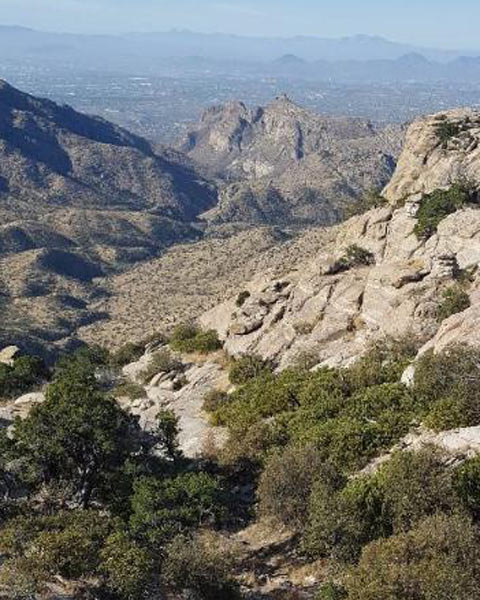
There are a lot of varying shapes and details in this scene — vegetation in the foreground, rock shapes, dark patterns of shadow, and some very faint hills in the distance. If you squint at the photo, you’ll see that all the main shapes fall into large zones of value and color. It is these large zones that define the shapes of a composition, not the tiny of details that may be contained within each of those zones.
Also see “Balancing Simplified Shapes and Detail with the 80/20 Rule” on pages 25-27 in The Landscape Painter’s Workbook: Essential Studies in Shape, Composition, and Color.
How the Direction of the Light Affects Differentiation
 Look For a Clear Crosslight
On sunny days, always look for a clear cross-light. A crosslight — a light-side and a shadow-side — enhances differentiation. A crosslight is also an essential cue that models form in three dimensions. Look for 1/4, 1/2, or 3/4 light. For landscape painters, this is a matter of painting (or photographing) at the right time of day and orienting yourself properly to the sun.
Also see on this blog Plein Air Setup: Establishing a Consistent Light on Your Palette and Painting and “Subjects with Diminished Cues”, pages 78-79, in Landscape Painting: Essential Concepts and Techniques for Plein Air and Studio Practice.
Backlit and Frontlit Subjects Without a Clear Crosslight
Not all subjects will have a form-defining crosslight. For example, backlit or frontlit subjects like sunrises or sunsets, or cloudy days. However, shapes can still differentiate themselves through color and value even without a crosslight, as shown in these two examples.
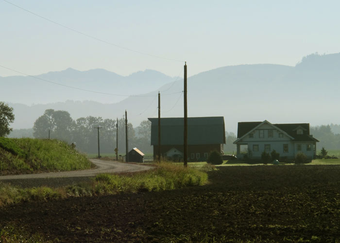
This farm scene is backlit, which creates silhouetted and flat shapes, but each shape is still very distinct from every other shape. You could take a pair of scissors and cut out each shape, like so many pieces in a puzzle.

In a typical sunset or sunrise, the shapes will be largely silhouetted. The question is: are those shapes distinct from one another? Do value and color differences keep the shapes separate? In this example, each element — the sky, the mountain, the line of trees in the distance, the reflections in the water, and the silhouetted trees in the foreground — has clearly defined shapes. Get those scissors out!
Setting Up the Spatial Stage
Our natural depth perception makes everything we see in the natural world appear dimensional. For a painting on a flat picture plane to convey a sense of depth, however, it must include certain spatial cues:
- Clear patterns of light and shadow
- Overlap and scale
- Perspective
Let’s look at the previous example with the outlines of the differentiated shapes. In terms of visual perception, elements overlapping one another tells us whether something is in front or behind, near or far. In this scene, each tree shape overlaps the next. The foreground grasses overlap the river bed and the large tree on the right. Also note the relative size of the elements. Large trees say “I’m close” and small trees say “I’m farther away.” If overlap and scale seem like very obvious cues, it’s because they are. They work in our paintings just the way they do in the real world. They are a reliable means of setting up the spatial stage. We just have to be sure to include enough of these spatial cues in our subjects.
Perspective Cues
Nothing counteracts the flatness of the two-dimensional picture plane and suggests depth more effectively than linear perspective. You do not have to be an architect or know how to plot one, two, or three-point perspective to take advantage of perspective. A road, a winding stream, a fence, a furrow in the foreground, or even a few unconnected objects that align along a diagonal can be all that’s needed.
Also see Chapter 6 “Site Selection” in Landscape Painting: Essential Concepts and Techniques for Plein Air and Studio Practice.
Observe
The qualities and cues I am urging you to find in your reference photos are the same qualities and cues you would look for when painting from life.
Tips for Taking Photos
Go for the sun — in morning or late afternoon
The most important advice I give to my students on taking reference photos is this: always endeavor to photograph in the mornings or late afternoons, as these times of day offer the most cross-lighting and the most interesting patterns of light and shadow. (There are also more interesting colors at that time of day.) Patterns of light and shadow = better differentiation. Avoid photographing on overcast days, as these photos are much more likely to have reduced value contrasts.
Avoid over-exposure and under-exposure

Even a photo with good differentiation and clear patterns of light and shadow can still be ruined if it is under or overexposed. In an overexposed photo, such as the one shown here, the sky has “blown out” to white and all suggestion of color is lost. The values in the ground are washed out and overly light, nowhere near their correct value. Although we never want to copy the color in a photo directly, we also don’t want a photo that gives us no color information at all.
Fortunately, many newer cameras, such as those found in mobile phones, have HDR (High Dynamic Range). This feature allows the camera to make a compromise exposure that doesn’t overexpose the lights (sky) or underexpose the darks.
See Convincing Color Relationships Between Sky and Ground in Landscape Painting.
Use your own photos
I recommend using photos you have taken yourself. You will have a more personal connection to subjects that have touched you in some way. These photos will make a more authentic statement about what interests you in the visual world. Working with your own photos is also a better learning experience. You will be able to see what works in the photo and what doesn’t. Photos clipped from magazines are too perfect and pretty. They are an already-resolved visual problem.
Conclusion
Our goal isn’t to find perfect reference photos. Even the best source photos won’t have perfect differentiation. Nor will every subject have every kind of spatial cue — clear patterns of light and shadow, overlap and scale, and perspective. But our goal is always to find more of these qualities than fewer. The more our source material has these qualities, the better chance we will have of producing landscapes that form clear and coherent compositions.
Tips on Preparing for My Workshops
Use photos that have not been previously composed (cropped)
It is a curious artifact of the digital age that, when working with photos, painters often don’t question the composition captured by the camera. Why? When they look through the viewfinder and press the shutter, they are in effect asserting that as the final composition. Then, when the photo is printed out with its crisp edges, it is a further assertion of the inviolability of the composition. One of the many ways we can misuse a photo is to assume it is a fully resolved composition. It may be, but in most cases, it’s not. For artists, it’s better to zoom out and take a wide-angle shot, which gives you more information. When developing a composition, you want the option of being able to crop the photo in several ways, which can only happen if you have that extra information all around the subject. In other words, don’t start with picture-perfect cropping.
Also see Exploring Landscape Composition Through a Limited Focus.
Sizing Photos
Smaller 5″ x 7″ prints of your photos are preferable to large 8″ x 10″ or 8-½” x 11″. In some of our exercises, we trace over the photo, and 8″ x 10″ or 8-½” x 11″ may be too big for this. If you are unfamiliar with how to make enlargements or reductions, here are some suggestions.
- If your image is digital and you have the capability to print from your home printer, then you can print out your own enlargements at half-letter size or 5″ x 7″.
- If you don’t have a printer at home, then you can bring the image file to a do-it-yourself photo kiosk, often found at pharmacies or FedEx office.
- If your photo is not digital, and all you have is a small 4″ x 6″ or large 8″ x 10″ print, you can make color enlargements or reductions at FedEx Office or any copy store.
Black-and-white (grayscale) versions
Black and white versions of your images can be helpful. A black-and-white photo makes it easier to read basic value patterns without the subjective distraction of color. If your image is digital, you can print out a black-and-white version from your home printer or convert the image to grayscale (black-and-white) in an image editing app on your computer or mobile device.