
A painting tells many stories — not the least of which is the story about the paint itself. Painters can apply their paint in a variety of ways: thickly, in a bold and expressive fashion, or thinly, in a slow and deliberate manner. This is the painter’s artistic handwriting — but it is just one part of the mix. The painting surface is also a factor. Its texture, be it rough or smooth, affects the character of the strokes, which in turn affects the overall look and feel of the painting. In this post, I describe the reciprocal relationship between paint and surface, and provide examples from painters working in three different mediums. I asked each painter to answer this question:
How does the choice of surface inform your painting style?
A two-way conversation between paint and surface
The act of painting is a conversation between the paint and the painting surface. When a painter applies a stroke, she is speaking to the paint surface. But the surface also speaks back to her, which in turn the affects the character of the strokes.
This is why there are so many types of surfaces for all types of media — for oil and acrylic painters, the weave of regular canvas versus the finer weave of linen; for watercolor painters, the choice of cold press paper (rough) versus hot press (smooth); for pastelists, the sanded papers that range in grit from coarse to fine. The choice of surface is never arbitrary.
When one paints on a textured surface, the quality of the stroke is partly defined by the underlying texture. By contrast, when one paints on a smooth surface, the stroke is more self-defining. The stroke sits on the surface, uninfluenced by the underlying texture or “tooth.”
For example, in a painting from my Rooftops 59th Street series (below), I began on a sheet of rough textured (cold press) watercolor paper. (As an oil painter, the paper was first primed with two coats of gesso.) After several hours, I found that the texture of the paper was too rough. As an urban landscape, it required a fair amount of tight painting and detail. The texture of the surface was interfering with the fine work needed. The solution: I began again on a smoother sheet of paper.
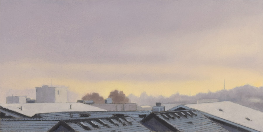 Mitchell Albala, “Rooftops, 59th Street, Winter Dusk,” oil on paper, 6 x 12. This small piece required a fair amount of straight lines and detail, so a smoother surface was called for. Greater texture would have interfered with my ability to render detail on a painting of this size.
How does the choice of surface inform your painting style?
The answers provided by each painter reveal how intentional their choice of surface is, and how it, supports their stylistic intentions.
Loriann Signori, pastel
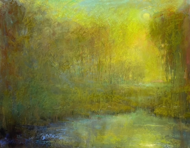 Loriann Signori, “Drama in Slow Motion,” pastel on paper, 17 x 24.
“I attempt to make my paintings a portal through which the viewer experiences nature’s energy. The surface is one of the first tools a painter utilizes to guide this process. In pastel, it begins with the support or surface. I find that Uart paper or Multimedia artboard are good substrates, as both offer a starting texture and a surface that is indestructible. Then, using layers of fixative, clear gesso, gamsol, and marble dust, I create layers of pastel, or what I call ‘goop.’ Activating the surface through wiping, scraping, and applications of this ‘goop’ allows the energy to become visible.”
See more of Loriann’s work at her website: loriannsignori.com
Sue Charles, oil
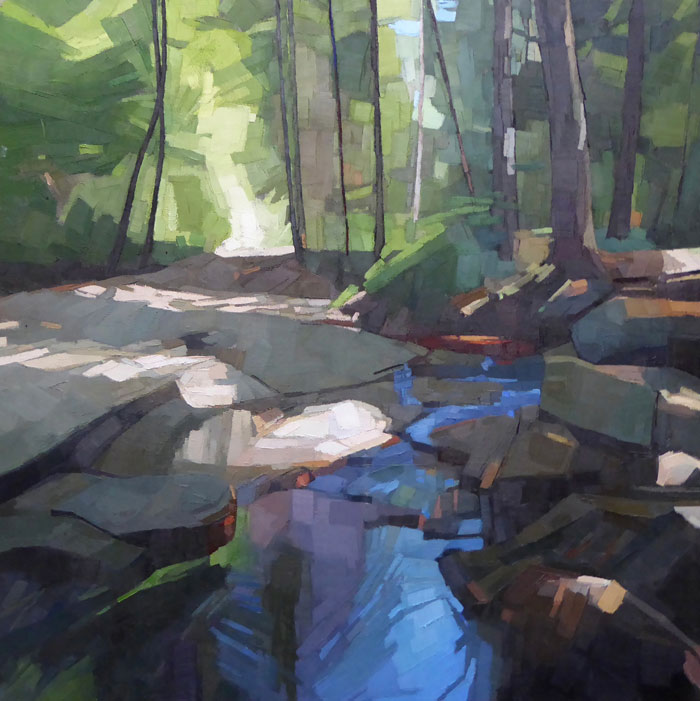 Sue Charles, “Headwaters,” oil on linen, 36 x 36.
“I prefer working on Senso clear primed linen. The linen itself has a slightly irregular weave, which is subtle but less mechanical than canvas, which I like. The surface is pretty ‘grabby’; i.e., there is some friction, which can act like a slight brake on my brush stroke, so it doesn’t run away from me. My directional strokes stand up beautifully on the linen, too. The clear primed linen is also a beautiful mid-tone, which helps with seeing the hierarchy of light to dark as I work, and acts as a wonderful place holder, so the painting feels whole even from the start.”
See more of Sue’s work at her website: suecharlesstudio.com
The next two painters are both watercolorists. Sandy Haight prefers how cold press paper, which is more textured, reacts with her brush, while Tom Hoffmann prefers the smoother hot press paper.
Sandy Haight, watercolor
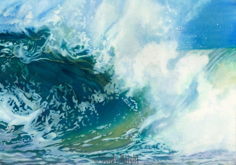
Sandy Haight, “Breathtaking Kai Mana,” watercolor on 300 lb Arches cold press paper, 41 x 29-½.
“I have a rather strategic, controlled style of watercolor (as opposed to an expressive, loose style), so I like to use cold press paper. It has a moderate amount of texture that prevents my brush from slipping around the surface too much, which would be the case on smoother hot press paper. It helps me control my brush better. Before starting, I also like to soak the paper to get out the excess sizing, and then let it dry. This makes the paper more receptive to my wet-on-wet process. With the sizing intact, the pigment would sit on the surface more. I find the pigment to be much more luscious on paper that has had the sizing reduced.”
See more of Sandy’s work at her website: sandyhaightfineart.com
Tom Hoffmann, watercolor
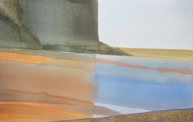
Abstract watercolor landscape by Tom Hoffmann.
Tom Hoffmann, “Sudden Paradise”, watercolor, 14 x 20.
“Because hot press [smooth] paper leaves every stroke visible, I like to know the subject well before I start poking around with my brush, looking for a graceful interpretation. Once I’ve found a way to translate what I’m painting into the language of washes and strokes, I can take advantage of the way hot press rewards confident brushwork. I take my time with hot press. The subject can simultaneously be both beautiful paint and intentional content.”
See more of Tom’s work at his website: hoffmannwatercolors.com