 Some of you may recall an app popular with plein air painters called Value Viewer. It allowed you convert a photograph to black-and-white and then convert it into two or three values. It allowed you to change the distribution of the shapes and values on the fly. Very helpful for composition! As of this writing, Value Viewer is still available, but has not been updated in five years, so it no longer works on most devices. Fortunately, a new app from another developer has been released, called Notanizer. The App is available for Mac and Android operating systems.
Notanizer can convert photos into two, three, or four levels. Not every subject translates well into just black and white (strict notan), so having a 3-level and 4-level option lets you find the distribution of shapes and values that is optimal for that particular subject. Notanizer will be of particular benefit to plein air painters. It can help save time in the field by quickly generating digital compositional thumbnails. (Think options!) Images will say it best, so I’ll demonstrate each of Notanizer’s “levels.” I’ll also offer some thoughts on notan theory as I go. You may also find two of my other primers on Notan helpful: The Wisdom of Notan – A Brief Introduction and Video Lesson: Exploring Composition through Shape and Notan.
 PHOTO, UNCROPPED. Notanizer allows you take photos from within the app, but does not allow you to crop the image from within the app. You’ll have to do that first on your mobile phone or iPad. The original, uncropped photo presents the seeds of a good composition, but there is too much extraneous information that distracts from the main focus.
 LIMITED FOCUS APPLIED, CONVERTED TO BLACK AND WHITE. A limited focus simplifies and gets rid of extraneous information. It “eliminates the unnecessary so the necessary may speak,” as Hans Hoffmann said. What i like about this subject is the upward movement of the hill and road, and the shapes made by the patterns of light and shadow. That energy is more focused with this limited focus imposed. Now, let’s bring it into Notanizer.

NOTAN. Notan is a Japanese word that translates as “light-dark balance.” It is a design principle that suggests that strength and balance in composition can be found through a harmonious relationship between light and dark shapes. If the arrangement of those shapes forms an effective abstract composition, then the painting that is built upon it, with all its color and detail, will also possess a strong composition.
Each of the options in the app has a slider. By moving the slider left or right, you can change the distribution or balance between light and dark. This makes all the difference. You can find the “sweet spot,” a balance of light and dark that clearly forms a better composition.
CONSIDERATIONS: This strict black and white option is “classic” notan and fits most artist’s idea of notan. However, it is not an effective option for some kinds of subjects. If the subject has strong patterns of light and shadow, as this one does, then the notan’s patterns of light and dark will nicely correspond to the patterns of light and shadow. But in many other subjects, lights and darks don’t necessarily correspond to light and shadow. The subject may require additional tones in order to distinguish essential parts of the composition. Let’s look at the 3-level notan.

3-LEVEL. The 3-level option adds a third tone. With this particular image, the ground plane is now assigned a mid-value. Note that there are two slider points with this option.
CONSIDERATIONS. Although the white, black, and gray of the notan are, technically, “values,” the notan is not a value study in the traditional sense. After all, in what kind of subject will two or three values correspond to the actual values found in the subject? But what those two or three shape-values can do is express the composition in its most basic shape terms. Yes, values matter, but in terms of notan, they matter because they define shapes.
With its minimal tones, the notan is much more suited to defining shapes and patterns than it is at describing value relationships.
Consider the action we see with a tool like Notanizer. As we change the distribution of lights and darks, we are changing the shapes of those lights and darks. And shapes are what a composition is built upon. It would be a mistake to think that the “values” displayed in the app are values that you should match precisely in your painting. They are just a relative guide. More important, the information to take away from the studies produced in Notanizer is the arrangement of shapes. Which arrangement of light and dark shapes forms a more pleasing composition? A good notan study, with a balanced distribution of lights and darks, will establish a solid foundation for any composition.

4-LEVEL. In some types of subjects, a fourth level/value may be revealing. In this subject, however, I gain very little with the addition of that extra tone. A few details are revealed in the foreground, but in terms of composition, details hold little importance. It is the main shapes that drive the composition.
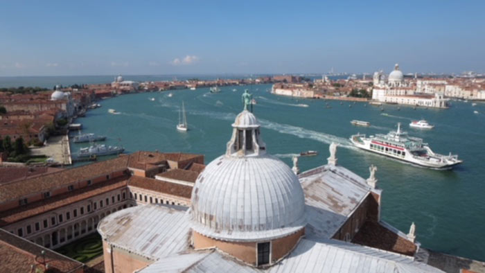
CONSIDERATIONS: With four levels, there are now enough tones to begin approximating the way value relationships actually present themselves in nature. (See Value Divisions in Landscape Painting.) Strictly speaking, the four-level option isn’t notan, but it can still be helpful in some subjects, as in the Venice photo below.
JUST ONE MORE. I had a lot of fun converting this complex scene from Venice with the 4-level option. Notice how all the detail and complexity can be organized into just a few broad value zones.

9 Comments
Great little app to replace Value Viewer. When at the app store I noticed that the app can be bundled with GridPainter, which lays a customizable grid over your image, which is really helpful.
Thanks for the tip!
Mitch,
I have always gotten lost pondering values in Notan. So I was particularly interested in your statement: “More important, the information to take away from the studies produced in Notanizer is the arrangement of shapes. Which arrangement of light and dark shapes forms a more pleasing composition? ” Analyzing potential shape choices could be very useful and relatively easy.
Thanks
Gerry
Gerry, you were right to get lost pondering values with the notan. In its familiar black and white (strict) form, it’s actually not about values at all. Many people think that it is, because the blacks of the notan sometimes correspond to shadows, but there are many intermediary values that black and white notan does not address. That’s why the 3-value notan is so important. What I’ve come to realize working with the notan for so many years is that, despite appearances, it is not really about values. It’s primarily a tool for shape and pattern definition. As I said, “the white, black and gray used in notan are, technically, ‘values’ but the notan is not a value study in the traditional sense.” Yes, values matter, but in terms of notan, they matter because they define shapes.
Thank you, I am a fan of my Notanizer app. I enjoyed your book and try to apply your principles. By all means, simple is best, but so hard to create. Like Yo Yo Ma says, “One measure a day.” I love working out my compositions in black and white before starting out in color. I find it helps to strengthen my composition which is one of my goals along with the color harmony. - Sharon
Thanks for your comment, Sharon. If you are working out your compositions in black and white before each painting, then it sounds like you are “seeing in notan” already. Congrats. I wish everyone understood the importance of these compositional studies.
Thank you, I am a fan of my NotanIzer app. I enjoyed your book and try to apply your principles.By all means, simple is best but so hard to create.. Like Yo Yo Ma says,”One measure a day”..I love working out my compositions in black and white before starting out in color.I find it helps to strengthen my composition which is one of my goals along with the color harmony. — Sharon
Excellent post, as always, Mitch! I’ve downloaded both apps suggested in your post and by Gerry. Super helpful! I can’t wait to use them in the field, so to speak.
Warm regards,
Rhonda
Hello, Mitch!
Forgive the translation of Google! You book is beautiful inside and out. I was surprised that you cropped the photo further (with the smallest shade of the tree). I have not downloaded the app. When outdoors, the devices do not display well, so I just do not use any. I think that the photographs on the phones tend to be a note in color, with its exaggerated lights and shadows at the expense of the average values. Regards! Ricardo
What a handy little app! Thank you for pointing it out. Let me take this opportunity to say how much I appreciate your book. I refer to it often and sometimes reread it cover to cover. It’s full of useful information and inspirational artwork.