


NEW LESSONS IN LANDSCAPE PAINTING:
Key Concepts and Exercises in Color and Composition
On sale Oct. 13, 2026
ORDER YOUR COPY
The third and final volume in my 3-book series, featuring new topics, exercises, and demonstrations not covered in either of my two previous books. With over 100 paintings by 54 artists.
Visit the “New Lessons” book page for contents, reviews, videos, and sample pages.

Mitchell Albala, The Cottonwood Tree, oil on paper, 11 x 8.25.
I’ve been painting outdoors for more than 25 years. I wish I could say that every painting I do now is a complete success, but that just isn’t the case. I do have more successes now than I did 25 years ago. Of course, I’ve practiced a lot and am a better painter now, but it’s also because I follow a coherent set of steps — an approach — that helps me stay on track and keeps me out of trouble.
This is the approach I teach in my workshops. Even if one can draw, compose, mix color, and handle paint reasonably well, if any of these steps are left out, one invariably runs into trouble. There are no free passes. Everyone, including the masters, had to consider each one of these steps.
Here then is the condensed version of “The Approach.” I’ve provided links to related articles at this blog and cited portions of my books, Landscape Painting: Essential Concepts and Techniques for Plein Air and Studio Practice and The Landscape Painter’s Workbook: Essential Studies in Shape, Composition, and Color, that explain the steps in greater detail.
It’s worth noting that three of the four steps all happen before you begin applying fully developed color. The approach is based on building a a strong foundation that makes the entire process more manageable.
Step 1 – Site Selection
Just because a scene is beautiful or interesting doesn’t necessarily mean it will translate well into a painting.
Site selection is one of the most overlooked steps in plein air painting. Nature fills our subjects with resplendent color and light, so it’s easy to assume that any scene can become a beautiful painting. Unfortunately, this is not the case. The three-dimensional “reality” that we see at the actual location and the synthetic two-dimensional reality of our painting are two different things. Nature always looks “right” because it’s real and we see it in three dimensions. A painting, though, is a constructed illusion. For a painting on a flat picture plane to be “readable” and suggest depth, its shapes and colors must distinguish themselves from one another and the painting must incorporate as many spatial cues from the scene as possible.
Further reading:
The Landscape Painter’s Guide to Selecting Reference Photos outlines the qualities to look for in reference photos, which apply just as readily to working from life.
Demonstration: Exploring Composition Through a Limited Focus
Landscape Painting: Essential Concepts and Techniques for Plein Air and Studio Practice
Chapter 6, Site Selection
Composition through the Picture Window, page 85
Limited Focus through Selection, pages 86–87
Step 2 – Compositional Thumbnail
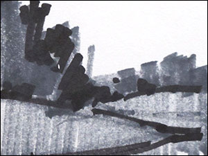
Good composition isn’t an accident; more often than not, it has to be extracted from the larger scene before us. Painters often do a thumbnail in the form of a line drawing, which is the least informative type of compositional thumbnail. A thumbnail that is shape- and mass-oriented is much more effective at capturing shapes, which is what a composition is built upon. Any given scene might present multiple compositions. Thumbnails allow us to test out multiple composition to determine which one is best.

A thumbnail doesn’t have to be highly accurate or very neat, but it must suggest the general placement of the main shapes. I typically limit the thumbnail to two values (notan) or three values. This keeps it simple and allows me to see the composition in terms of its basic shapes. It’s easier to do a shape-oriented thumbnail if you use a bold drawing instrument, like a soft pencil (6B) or markers, as shown here.
And don’t forget the power of the picture window — use your viewfinder! The viewfinder helps you “eliminate the unnecessary so the necessary may speak.”
Further Reading:
Composition Before Color — Considerations in the First Phases of Plein Air Painting
Landscape Painting: Essential Concepts and Techniques for Plein Air and Studio Practice, page 110, Stage 1: Preparatory Work
The Landscape Painter’s Workbook: Essential Studies in Shape, Composition, and Color, Building a Better Study, page 91
Step 3 – Underpainting or Block-in
An underpainting is the first phase of the painting, meant to establish value, drawing and composition before getting fully involved with color application. An underpainting lays a foundation; it serves as a guide for what’s to come. It is a step that is overlooked by many painters. It’s true it adds some time to the short sessions of outdoor painting, but it lays a foundation that will save you time and prevent backtracking later on.
Over the years, I’ve worked with two types of underpaintings. The most basic type — and the one I recommend for beginners — is monochromatic underpainting. It builds the foundation with just one pigment color, while aiming to establish the values, drawing and basic composition. Why begin with one color? Because it is very difficult for all but the most experienced painters to consider composition, drawing, and value at the same time they are thinking about color. Separating the monochromatic underpainting from the painting’s color development breaks the process down into more manageable steps.
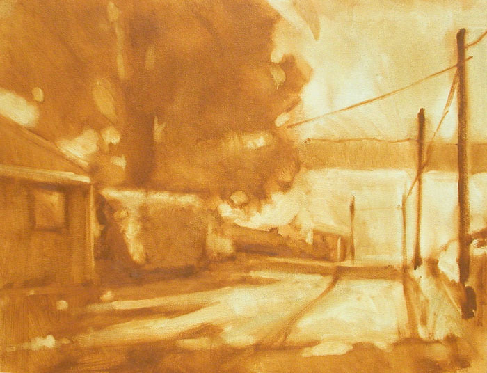
Mitchell Albala, Old Willow Road, oil on canvas, 12 x 16. An example of monochromatic underpainting made with Raw Sienna. The single pigment color is used to establish values, drawing and composition. Colors are applied over the underpainting in the later stages.
Note: Although monochromatic underpainting begins with a single color, that color can be chosen to support the color direction of the painting. This idea is explored in this post: What Color is Your Underpainting? The Monochromatic and Two-Color Methods.
 The second type of underpainting is the color block-in. Here, instead of beginning with a single pigment tone, the painter “blocks in” the composition’s foundational shapes in the desired color and value. As you might imagine, this is much more difficult than monochromatic underpainting because it requires the painter to think about value, drawing, composition and color at the same time. For this reason, I recommend the color block-in to more experienced painters or those who have first gained proficiency with monochromatic underpainting. Although it is more difficult, the color block-in is the approach adopted by most plein air painters.
Further reading:
Landscape Painting: Essential Concepts and Techniques for Plein Air and Studio Practice
Step 2: Underpainting, pages 132–139
Step 4 – Paint Handling and Color Application
Finally, we begin actual “painting” — mixing colors and applying fully-loaded pigment to the canvas. Painters like to rush ahead to this step — what they consider the “fun” part. But if our color and paint handling is going to work, it must be built upon a solid foundation, which is what Steps 1 through 3 are about. As you get better, you can move through the steps more quickly.
Step 4 requires the most time. It demands an understanding of color theory and color mixing, as well as facility with paint handling. Everything involved in this step cannot be condensed into a few short paragraphs; however, I have a few suggestions that can make this step more manageable.
Take your time. In plein air painting there is a popular belief that one should work quickly and apply paint liberally. This is a fine idea if you are as good as Sargeant or Sorolla, but until you have that kind of facility, take it slow, be mindful of each stroke, and build your paint in controlled layers. The plein air painter has to build up this to this kind speed over time.
Consider a limited palette. Getting colors to work well together is not always easy. A limited palette can help. A limited palette is a small set of pigments, usually a cool and warm variety of each of the primaries, plus white. Sometimes there may be an additional pigment or two. Fewer pigments lead to colors and mixtures that are more interrelated and harmonious. I don’t use the same limited palette for each subject, either; rather, I choose a set of pigments that are keyed to the color plan I have in mind. In my workshops I say, “Use whatever pigments are called for, but no more than absolutely necessary.”
Further reading:
The Landscape Painter’s Workbook: Essential Studies in Shape, Composition, and Color, The Limited Palette, page 91; The Targeted Palette, page 155 – 158; The Split Primary Palette, page 159.
Tips for oil painters
With oil painting, working wet-into-wet is a challenge. The most common problem is overworking, which results in a muddied surface. You can minimize the potential for this if you work in layers — from thin, to thicker, to thickest. Don’t apply thick, impasto strokes unless you are sure that you are not going to work that spot again. To apply fresh color over wet paint, you must apply paint that is thicker than the layer underneath. For this to work, you have to do three things:
- Use a soft, flexible brush. A stiff or crusty brush will scrape through the underlying layer. You want the opposite effect: the ability to apply a light stroke that will sit on top of the previous stroke without disrupting it too much. A soft brush is gentle on the previous layer.
- Use a light touch. Apply one or two strokes without pressing too hard, and leave it! Lots of rubbing and stroking is a sure way to destroy the underlying layer and create mud.
- Use enough paint. Remember, the layers build from thin, to thicker, to thickest. You can’t get a fresh layer to sit on top of a lower layer if you don’t have enough paint on your brush.
5 Comments
I just saw your lesson on the “5 essential steps to plein air painting.” I love the way you teach! It’s very clear. I’ve been plein air painting for the past year. Your 5 essential steps will help. I can see that following these steps will weed out problems early on, so the painting essence can be focused on. Look forward to taking one of your classes at some point! I loved your book, of course. Thanks!
Thanks for this great summary Mitch. I’ve been painting outdoors with our Evergreen Assoc. of Fine Arts group and following your steps and batting about .350 on successful work, which I am happy with, I’ve found those who don’t follow such a method as yours, tend to fumble around and rarely do a successful work. The first two steps in particular are essential because if the composition is weak to start with, the work will never succeed. Then the block-in to set up the shapes and lights and darks lays the foundation. The main part I still struggle with is the color strategy ,(yes, despite your classes on this), as I tend to still want to “copy” the scene too much but I getting better at finding the colors in the scene I need to liven it up and incorporating them even if they are not in the field of vision of the scene.
I have had your book since its printing and never tire of re-reading it. I have a question about brush choice and a suggestion for warming up white.
Brush: you mention using a soft, flexible brush. Is there a particular type you can recommend. I just got W&N Monarch, and have old ones of Badger hair. My usual brushes are synthetic watercolor brushes with short handles (long ones usually get caught on my sleeve somehow).
Warming White: May I suggest Gamblin’s WARM WHITE. It’s perfect. Same with their COOL WHITE.
Keep writing and sending your posts. Excellent. Perfect timing.
Elizabeth
Thanks for your question, Elizabeth. There are many brushes of the “soft” type I am describing. These are often the synthetic brushes that are rated for both oil and acrylic. Of course, if you are an acrylic painter, then you only need to get the brushes that are just for acrylic. I can’t recommend a specific brush; you should try them out — by feeling them — in the art store. As noted in the article, if they are too firm or too soft, then it defeats their purpose. As for the warm white, yes, I have liked that color, too. I talk about a variety of neutral pigments and whites in this post: “Neutrals: Selecting the Right Neutral Pigment for Your Palette.”
Your post arrived at the same time as the sun here in Seattle, so perfect timing … and your very comprehensive discussion of the very issues I struggle with has been so helpful. Thanks, Mitch!