

 This August I was privileged to be asked to jury the 2019 Whidbey Island Plein Air Paint Out, sponsored by Pacific Northwest Art School. Over 60 artists produced multiple paintings over the course of three days, culminating in an exhibition and awards ceremony on Friday night. Over 120 works were exhibited and awards were given to seven painters.
Working outdoors under the rigors of heat, cold, wind and fleeting light — and doing it in a very limited amount of time — is one of the greatest challenges there is in painting. Kudos to all the dedicated and talented painters who participated.
Please scroll down to view all the winners.
BEST OF SHOW
Jane Wallis – “View Along West Beach Road”

Wallis’ painting fires on all cylinders — color, composition, and paint handling. All are masterfully handled. She maintains an exquisite balance between large masses (which are the foundation of the composition) and smaller details, as seen in the houses and telephone poles. This is a painting one could live with and absorb something from every day.
See more of Jane’s work at her website: janewallis.com
FIRST PLACE
Theresa Saia – “Wet Sunshine”
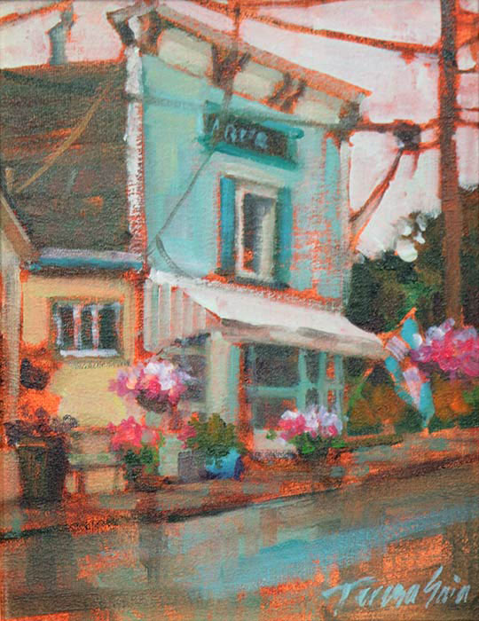
Teresa’s “Wet Sunshine” is a big idea in a small package. It exemplifies the idea of “saying more with less.” The small flecks of orange throughout the piece are the thin underpainting color showing through the successive layers of color. It requires a deft hand and eye to place additional color and form over that underlying layer and leave the orange to peek through in just the right places. She has a delicious variety of color, yet maintains an overall harmony through tightly knit color groups.
See more of Teresa’s work at her website: teresasaia.com
SECOND PLACE
Amanda Houston – “Greenbank Farm Reflections”
“Greenbank Farm Reflections” (pastel) is striking in its directness and simplicity. On the “macro” level, our eye is drawn to the bold simplified shapes — the dark trees and shadow in the water, and the bold chartreuse green. On the micro level, her strokes create many delightful marks and details. These always remain subordinate to the large masses, which keeps the “macro” and “micro” experience in balance.
See more of Amanda’s work at her website: amandahouston.com
THIRD PLACE
Diana Sanford – “Morning at the Lagoon”

“Morning at the Lagoon” takes an “outside the box” approach to plein air painting. As an abstract artist, Diana builds her composition with large, flat abstract shapes. We can appreciate the painting on that level, and we can also revel in the painterly, agitated mark-making that fills each shape. Is the painting about the lagoon, or is it about the shapes and the mark-making?
See more of Diana’s work at her website: dianasanford.com
HONORABLE MENTION
Susan M. Payne – “From the Wharf”

Susan’s piece reminds us that a painting exists on multiple levels. Up close, it is a tangled web of painterly strokes. It is about the the paint itself. Yet when observed at a distance it resolves into to a clear representation of a wharf, and even maintains accurate perspective. Making a painting be interesting and alive, from both near and far views, is a balancing act that requires a keen eye and hand.
See more of Susan’s work at Instagram.
HONORABLE MENTION
Jed Dorsey – “Chosen”
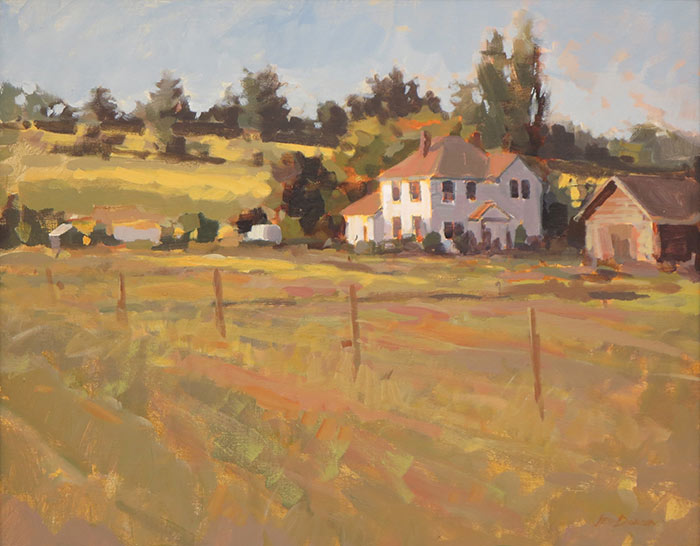
The first thing that struck me about Dorsey’s “Chosen” was the beautiful neutral harmony. Neutral or muted colors don’t shout as loudly as bright saturated colors, but they can be very effective at suggesting a unified light and harmony. Jed’s hand is extremely sure: each stroke is confidently placed where it belongs, in the right color and in the right value. It is no easy task to coordinate so many strokes with such cohesive color.
See more of Jed’s work at his website: jeddorseyart.com
HONORABLE MENTION
Susan McManamen – “Coupeville Auto Repair – Night”
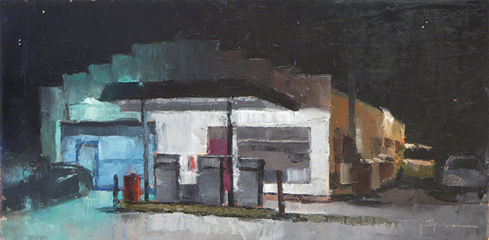
Susan’s paintings were the only nocturnes in the exhibit. Her choice of subject and her willingness to forgo sunlight was nothing short of courageous. I also appreciated the more saturated colors (in the turquoise bay door and red gas pump) played against the largely “colorless” black of the night. Ever the storyteller, Susan even included a few stars in the colorless sky.
See more of Susan’s work at her website: susanmcmanamen.com
1 Comment
Dear Mitch, I appreciated all the comments about the strengths in the paintings that you shared in this post. Congratulations to all the Plein Air Painters. It must have been great to paint Whidbey Island! The paintings are all lovely and your critiques highlighted some very fine examples of the things you teach such as balance of masses, values, colour and story telling. As an artist interested in expressionism and colour dominance, I appreciated the marks in Diana Sanford – “Morning at the Lagoon” and especially liked the choice of saturated colours you mentioned in Susan McManamen – “Coupeville Auto Repair – Night. Just the right amount of “spice” in this composition of muted tones and strong contrasts. I learned a lot from your classes and this post. I continue to keep in mind what you taught while venturing outside the box in my exuberance. Keep up the good work!