


NEW LESSONS IN LANDSCAPE PAINTING:
Key Concepts and Exercises in Color and Composition
On sale Oct. 13, 2026
ORDER YOUR COPY
The third and final volume in my 3-book series, featuring new topics, exercises, and demonstrations not covered in either of my two previous books. With over 100 paintings by 54 artists.
Visit the “New Lessons” book page for contents, reviews, videos, and sample pages.
Landscape painters are explorers, especially in the realm of color, where color options are nearly infinite. One of the paradoxes of the artistic practice, however, is that narrowing our options often leads to better results. We use limited values to simplify value relationships and define shapes. In composition, we eliminate extraneous information by imposing a limited focus. And so it is with color development.
Defining the Color Group
Because color elicits such an emotional response, painters can be tempted to infuse their work with a range of hues from every part of the spectrum. Yet even the novice will recognize that harmony isn’t achieved by using every color. As Sir Kenneth Clark said, “All color is no color.”
When we take in the overall color impression of a painting, we often find a dominant color, or set of colors, on which the painting is based. Painters sometimes refer to this as the color “key” or color “chord” of the painting. There may be a single chord (as in a monochromatic painting), but more commonly there is a major chord and a few minor chords. These are the color groups.

Like a musical chord, in which related notes combine to form a unified tonal impression, a color group contains individual “notes” of color that collectively form a unified and harmonious impression. Above, colors vary in value and saturation level, but they all fit within the overall red-violet color group. Color groups are typically fromed by colors that are related in hue and value.
How many color groups should there be? The paintings featured here have around three color groups. This may sound restrictive — yet none of these paintings appear stunted in color or diminished in any way. Quite the contrary; only the color groups are few in number, not the individual colors.
Limiting Groups, Not Individual Colors
 Above: Loriann Signori, “The Alchemy of Light,” pastel on paper, 12 x 12″
Color grouping imposes no limits on the hundreds of individual colors there may be in a given painting, but it does ask that those colors fit into a small number of well-coordinated color families or groups. This is what we see in Signori’s The Alchemy of Light. The painting has just three color groups: a dominant yellow group, plus red and blue groups used in lesser amounts. Although there are only three groups, there aren’t only three colors in the painting. The yellows, reds, and blues criss-cross in a tapestry of threaded color. As the three main groups commingle, many nuanced notes of individual colors are born.
Color grouping suggests that a strategy composed of fewer groups has a better chance of producing harmonious color than an array of divergent colors. By holding to a small number of groups, we avoid overly complex palettes that lose their ability to cohere and form landscape-like harmonies.
Color grouping is not a complicated or abstruse theory. Once you begin looking at landscape paintings with an eye toward grouping, you will see that they are used all the time. Any landscape painter who is sensitive to color harmony and unified light will instinctively look for ways to bring greater unity to the myriad and sometimes disparate colors nature presents.
For additional examples of color grouping, check out my Color Grouping Landscape board at Pinterest.
How Do Color Groups Relate to Color Strategies?
Color groups and color strategies are related, but they are different concepts.
The color strategy is the overarching color plan for the painting, and is formed by three types of color relatiohsips: hue interactions, relative value contrasts, and saturation levels. (See the expanded definition of the color strategy below.)
Color grouping works within the strategy to in order to bring a tighter focus to the strategy. By restricting the number of color groups in a painting, we can better keep the color strategy under control and increase our chances of creating good color cohesion.
Expanded definition of the color strategy
When painters talk about “strategies,” they are usually referring to the color relationships found on the color wheel (analogous, complementary, etc.). More accurately, these relationships are called hue interactions. They define the way different hue families interact with one another. As important as hue interactions are, they do not form a complete color strategy on their own. A complete strategy also involves two other essential aspects of color: relative value contrasts and saturation levels. For a full overview of the complete color strategy, see Chapter 6 in The Landscape Painter’s Workbook: Essential Studies in Shape, Composition, and Color.
 Above: The complete color strategy can be likened to a three-legged stool. One leg correponds to the hue interactions; another to relative value contrasts, and a third to saturation levels. All three of these color relationships are at work in any given painting, and all three working together to form the complete color strategy. Let’s look at that in practice in the the example below.
 Mitchell Albala, “Silent Sound,” pastel on paper, 5 x 6″
The three “levers” of the color strategy: hue interactions, relative value contrasts, and saturation levels. They all work together to guide the overall strategy.
HUE INTERACTION: Formed by the relationship between the dominant blue and the violet-pinks on the right. These two groups commingle a lot, so they appear nearly analgous. But they also have enough of a temperature difference to provide the essential hue contrast for the painting.
VALUE CONTRAST: Closely related, hovering in the mid-range, which is what gives the subject its atmopsheric quality.
SATURATION LEVEL: Mid range. Had the colors been fully saturated, they would have distracted from the atmopshetic effects. Had they been desaturated to the point of being gray, the quality of colored light would have been lost.
Thus, the color strategy is formed by the relationship between hue interactions, value contrasts, and saturation levels (which in this case all work to build a sense of atmosphere and colored light). Here, the color strategy works within two color groups or families.
Color Groups in Action
Let’s look at several paintings that employ color groups to great effect. For each painting I have created a color swatch set that captures the basic color groups found in that painting. Note that in each swatch set, I don’t indicate every individual color that appears in the painting, but the two or three groups that all the individual colors would fit into. As always, color groups consist of colors that are related in hue and value.
 Mitchell Albala, “Alpental, First Light”, oil on paper, 6.5 x 5.5. Collection of Pearl Rosen-Golden
This painting uses a very limited palette with just three color groups: the light pink-orange that dominates the left and upper portions of the painting; the pale medium violet that is seen mostly in the right half of the painting; and the darker brown-violet that is used at the bottom and in the dark shadow accents. Respectively, each of these groups can be seen as light, half-light, and dark. Although the palette is limited, with closely related colors, contrast is achieved by emphasizing temperature and value differences between the groups. The small yellow accent in the swatch corresponds to the sunlit ridge atop the mountain. It’s probably too small to quality as a color group in its own right, but is important enough be included as an accent within the swatch.
 Edgar Payne, “Sycamore in Autumn”
Sycamore in Autumn has many individual notes of color — in the leaves of the tree and on the leaf-covered grass below — but it consists of only three color groups. The dominant group is the yellow-gold color, which consists of a lighter yellow and a darker yellow ochre. These two yellows are within the same hue family, so they form a single group. The other two groups, green and brown-violet, are used in lesser amounts in the painting, so they occupy less area in the swatches, as well. The small accents of red-brown and sky blue are too small to qualify as a full color group, but they offer small glimpses of contrast, so they are indicated in the swatch set as very tiny accents.
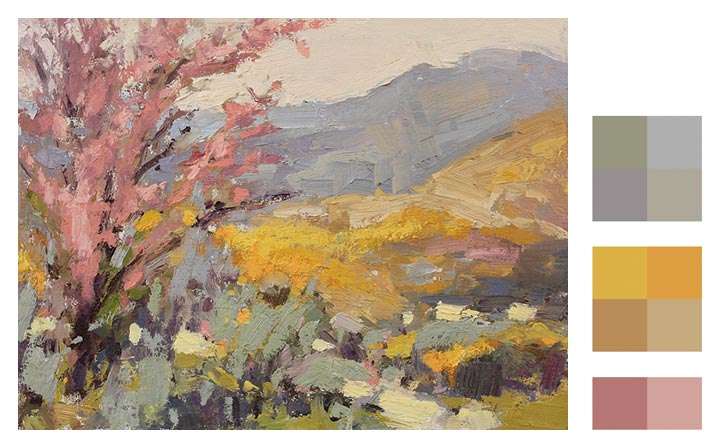 Scott Gellatly, “Desert Flora”, 2015, 11 x 14
In this analysis, instead of painted swatches, colors have been digitally sampled from the painting. Gellatly’s gestural style fills the canvas with many small strokes of color, yet those strokes are roughly organized into three color groups: the deep yellow in the mid-ground, the pinks in the tree, and the contrasting cool and warm grays in the mountains, sky, and foreground. There are other accent colors that do not fall into any one of those color groups, such as the green touches at the very bottom or the darkest gray violet strokes. But they do not compromise the color grouping. It is the most dominant colors that form groups and serve as the foundation of the color composition. Color groups are an expression of the color strategy in its most basic and obvious form.
 Michael Ferguson, “Granite Lakes Trail,” 33 x 24, acrylic on panel
Ferguson’s style is a complex tapestry of broken color that adds an exciting dimension to the color composition. Much like an Impressionist, Ferguson uses many small touches of broken color, juxtaposing cools, warms, and contrasting hues alongside one another. This diversity of color is kept under control by organizing those colored strokes into color groups of closely related hues and values — the sky, the hill, the tree line, the snow, and so on. In this example, the swatches are extracted from the painting itself, in order to show the complex harmonies formed within each color group.
You wouldn’t for a moment mistake any of these color group swatches as belonging to any painting other than the one they are meant for. That’s because color groups, when handled properly, are an accurate reflection the color strategy in its most basic form.
To find out more about the painters featured in this article, please visit:
2 Comments
Mitch,
The obvious success of limited color choices in Orcas Squall, Palm Garden and Desert Flora make your point well. In Orcas Squall, you have managed an ethereal effect (very suitable for clouds), caused in part by you analogous harmony but also with special, delicate brush work. There is something about the way you have done the blues and the gray greens that causes one to look at/search out the subtle shifts in color. The painting fosters and rewards study which I suppose is the ultimate compliment for a composition. The black sheep in this family photo is the violet gray which you acknowledge could be regarded as not of the other color groups. The other colors have an easily seen logic. This color choice is the deo ex machina solution of a master, but it balances with the dark blue sky, the two different colors but matched values effectively holding hands so that the dark corner does not fall out of the painting. The eye is further stopped by the point of greatest recession and special interest being near the bottom of the painting, up about one eighth of the painting height from the bottom, well pointed to by various other cloud shapes. This interest point is surprisingly low but is strong enough to pull the eye to that base from which to look up at the rest of the cloud. All of this very subtle work would not be noticed in a more varied-color painting.
Palm Garden color is very limited in color choices but extremely active and well integrated with a remarkable crispness to all parts reflecting the sunny day. Lisa’s terrific color choices, in my opinion, were not obvious when she stood in front of those steps, although studying Gauguin would have helped her to at least realize there were some special dark green options. Desert Flora is a gem. My first thought was that all of the colors play lusciously together; there is no black sheep or god-out-of-a-machine drama. Then I realized the pink tree was the black sheep of his painting. I have never seen a pink or red tree in the thousands of desert miles I have traveled. My bet is Scott created the color of that tree to fit his painting, not just as a foil but also as a color that plays a critical supportive role throughout the painting. It is the sauce that makes the dish; the pink brings life to all the other color groups. (The rest of us put in the red-oxide earth so common in the deserts, I know, but not in the one he painted!)
There is mastery expressed all over these paintings. I like the group color-limiting ideas you have described and will incorporate them. I would slit my wrist to absorb the knowledge that would provide me easier access to the non-obvious, seemingly not-logical color choices my paintings also need. But I can now see that one has to make room for those god-strokes by holding back on how many other colors they have to compete with.
Thanks, Gerry, as always, for your astute comments. Which enhance the import or the article. Thanks for your keen powers of observation and I hope color grouping does make its way into your paintings! Onward!