


NEW LESSONS IN LANDSCAPE PAINTING:
Key Concepts and Exercises in Color and Composition
On sale Oct. 13, 2026
ORDER YOUR COPY
The third and final volume in my 3-book series, featuring new topics, exercises, and demonstrations not covered in either of my two previous books. With over 100 paintings by 54 artists.
Visit the “New Lessons” book page for contents, reviews, videos, and sample pages.
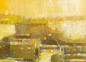 Every landscape painting I do begins with a color study. It’s a practice I adopted in college when my interest in painting the color of light was in its formative stages. Now, whether I’m doing a small painting in the open air, or a more developed piece in the studio, the color study is an integral part of my process. Without it, I would not be able to face the audacious goal of translating light into paint.
Although color is highly subjective, it is anything but random. The color study is an extension of the idea that color is intentional. As landscape painters, we naturally “borrow” the color relationships we find in nature, but we also rely on color strategies — specific color combinations and relationships that can be used as a formula for building our color composition.
For example, we might use one of the hue interactions mapped on the color wheel, such as analogous harmony or complementary colors. We might use bright saturated colors, or develop a harmony based on neutral colors. Or use strong value contrasts as a Tonalist might, or more staurated colors within a narrower value range, as an Impressionist might. A color study also helps you determine which particular pigments will best create those relationships and mixtures.
Also see The Complete Color Strategy, Chapter 6 in The Landscape Painter’s Workbook: Essential Studies in Shape, Composition, and Color.
I’ve always been surprised by artists who dive into a painting without having a clear color plan. It’s true that many color relationships are worked out during the course of the painting, but the clearer your plan is at the outset, the more likely it is that you will arrive at an effective color solution in the end. The color study is a way to test that plan. Color studies take extra time, of course, and to some they may seem like an overly formal process, but there is no better way to expand your color vocabulary and flex your color mixing muscles than with color studies. They can be fun, practical, and very rewarding.
Befriending the Color Study
When I reflect on so many years of doing color studies, I can think of at least four ways they have helped my practice.
1. Getting the light right. In landscape, each painting is typically pegged to a moment in time and a particular color of the light. Color studies are a great way to determine which color-light works best for a particular subject. The goal is to work out the color in a simple study before you tackle the larger painting. When painting outdoors, I respond to nature. Like the Impressionists, I try to capture the colors as I see them — even though I know that perfect matches are not possible. Here the color study serves as a way for me test which pigments and color mixes will translate the color of the light in that particular subject. In the studio, surrounded by four walls and artificial light, I cannot respond to nature in the same way. Instead, my approach to color must be partly invented. I rely on photographs and collected memories of sunlight on certain subjects at certain times of day. I am willing to experiment, which is the whole point of the color study. Also see The Gifts of Plein Air – Living Color through Direct Observation.
2. A colorful warmup. Color studies are the perfect warmup exercise. Think of them as a painted thumbnails. Not only do you familiarize yourself with the colors, but the basic design and sketch establishes the basic composition and color groups. The smaller the sketch, the more painterly it is likely to be.
3. No pressure!
A small study is a low-pressure exercise. You are less likely to be invested in a small “disposable” study than you will be with a larger studio piece. This makes the study a safe place to explore (and get lost) without a large time commitment or attachment to the outcome. Of course, color studies sometimes come out very well and are mini-masterpieces in their own right.
4. Beyond photographic color. Many landscape painters work from photographs. There is nothing inherently wrong with this practice — as long as it’s done properly. Far too many artists do nothing more than copy the color they see in the photo, which circumvents the act of translating or inventing color. A series of color studies can liberate you from the single and often limited option proposed by the photograph’s color. Studies force you to try alternate strategies and encourage you to be more creative with your color choices. (Also see Using Photographs Like an Artist.)
Color Study Examples
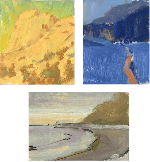
A small 4 to 5″ study, like those shown below, can tell you everything you need to know. They convey the basic foundationsal shapes that define the subject. They convey the basic color families that define the strategy, and they allow you to figure out which pigment colors you will use in your mixes. They also pay respect to the idea that a landscape painting is often pegged to a particular color of light or time of day. Each study has its own unique palette built with a limited set of color groups.
TIP: Work small and don’t fuss with detail. The color study isn’t necessarily a place to work out complex drawing issues and details. Working small — approximately 4 to 5 inches — is one way to prevent you from fussing with details.
2 Comments
Great information. I am doing Virtual Art Academy on line and I am just starting a lesson where I have to do color studies. Coincidence? What a great way for a new painter to learn about all the color combinations on the color wheel. I used to think it was just a wheel of color and now I am seeing just what it truly means and is. Thank you for the article and I will be doing a ton of color studies to understand color, light and, shapes. I find it so hard to see what is really there, to break down shapes and patterns.
Thank you, Mitchell, for sharing this. I received your wonderful book for my birthday and am right at the beginning of the landscape journey. So much to learn! Great advice.