

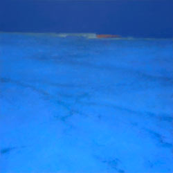
Mitchell Albala. Night Passage, oil on panel, 20″ x 20″
It’s early September and the plein air painting season is drawing to a close (at least for those of us in the unfortunate climes). As I’ve been working with students in my workshops and painting outside on my own, I’ve been reflecting on the nature of observation and the different way I think about color when working outdoors and when I’m working in the studio.
Color choices in the landscape are a combination of direct observation and interpretation. We begin by borrowing from the colors we see, but inevitably we modify or alter the color we see when the painting demands it. In plein air painting, working directly from life, we rely much more on direct observation of colors. In the studio, when we only have flat two-dimensional references like photos or studies, which are not life, we rely almost entirely on interpretive color.
In plein air: direct observation
When I paint en plein air, there is nothing between me and the subject but the air. I experience every nuance of light and shadow, color, and atmosphere my eyes are capable of registering. This is the gift of plein air. Much of the excitement of the plein air experience is playing with the colors I see. If I am not trying to do that, then why am I outside in the first place?
When I paint outdoors I am engaged in an intense conversation with nature, observing the colors before me and attempting to perform a type of visual translation.
If I see a subtle orange hue glancing across the treetops, I will try to mix that color as I see it. I will try to identify the particular hue, how light or dark that hue is, and it’s relative saturation level. I will squint fiercely, and cast my eye between the subject and my painting and look for communion, for parity. Can I capture a color impression that is close to what I see? I know that pigments and canvas cannot compete with the luminosity and brilliance of natural light — but I can try! That is the play of the outdoor painter.
In the studio: indirect observation
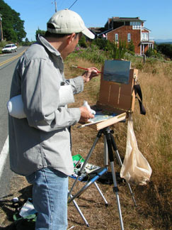 When I’m painting in the studio, my response to color is very different. It has to be. In the studio, I have visual memory, photos, and perhaps sketches or color notes — but I am no longer connected to living color like I am when working outside. My choices about color must be processed differently because I am working with color in an indirect way. When I’m painting in the studio, there’s no conversation in my head that says, “Well, that’s a blue sky, so I need to make it blue.” In the studio, I don’t choose colors that way. I develop an overall color plan that fits my particular goals for that painting.
The difference between interpreting color outdoors and in the studio may be seen in this way: in plein air I am much more involved with the colors I actually see. I take liberties, to be sure, but I am working toward a reasonably faithful impression of what I see. In the studio, it’s the reverse. With no connection to living color, the colors are more my own. I may call upon my years of experience observing and mixing color in nature, but I become the inventor of my color plan.
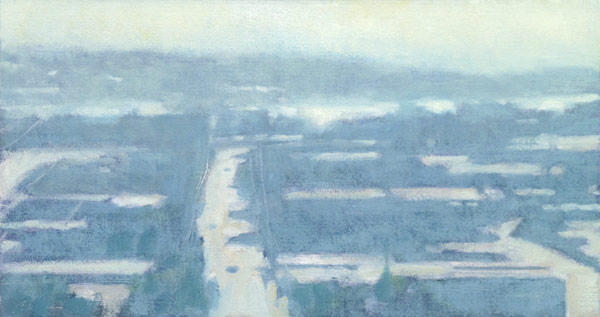
Mitchell Albala. Azure and Asphalt, oil on paper, 7.5 x 14. In this plein air piece, I was interested in capturing the glare of brilliant sunlight light on the streets as the sun set. Can I truly do that with paint and pigment? Never. But with an eye toward perceived color, I am engaged in the plein air painter’s most essential form of observation. See more paintings from the series: New Works from the “Azure and Asphalt” Series.
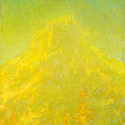
Mitchell Albala, Border Peak in Sunlight, oil on panel, 12 x 12.
In Border Peak in Sunlight I am also very interested in the glare of sunlight. But unlike Azure and Asphalt (above), which is based on an observed color experience, Border Peak uses color in a more inventive way. I may recall what the glare of brilliant sunlight looks like and how it felt to me, but to capture those sensations in the studio, I don’t refer to the photo. Instead I build a unique color strategy that fits my vision of brilliant sunlight.
Additional Resources
Landscape Painting: Essential Concepts and Techniques for Plein Air and Studio Practice
Real Light vs. Panter’s Light: The Limitations of Paint – page 104
Plein Air Demonstration – page 152
Studio Demonstration – page 156
Plein Air Painting: Beginning at the Source – page 34
Matt Smith on the Synergy Between Plein Air and Studio Painting
On Location with Stasinos and Albala: Same Subject, Different Visions
5 Comments
Your painting, Border Peak in Sunlight, glows, and the more I focus in and linger on it, all these interesting spots of color appear that capture my attention and won’t let me get away. It is certainly an ideal description of what is meant by “a feast for the eyes.” The rods and cones of my eyes are having a party as I observe the painting; great complimentary combinations, vibrancy, interesting shapes, and on and on. I still don’t know how you master that color thing, but I sense you probably have a good time and a lot of fun in the process. Congratulations!
P.S. One of these days I’ll take another class — they were one of the most memorable for me.
Thank you so much for this post. It’s an affirmation of one of the reasons I spend most of the year painting outdoors: to observe and capture the colors as nature presents them, and turn them into a meaningful, aesthetic sense of place.
Your painting Border Peak in Sunlight is an inspiration to approach photos in a new way when I’m forced back into the studio in a couple of months.
Thanks again.
Thanks for this piece. It kind of helps quiet down some of the chatter going on in my head about what to do when I’m painting outside. The piece above, and the Matt Smith article make it clear that my job outside, at least for me now, is to attempt more accurate translation.
Thanks for another great clarifying article. I get hung up on perceived color, and especially local color when working indoors from reference photos. But your guidance has let me get to a certain point after the initial block-in where I toss the photos and then ask, “What does the painting need now?” The next trick is to consistenty use your color strategy ideas and do that from the very start.
Thanks, Dina, for your kind words and your keen eye. I’m very proud of that painting, but it isn’t often that someone comments on the subtle color reactions within the overall tapestry. Yes, I do have a good time when I’m doing that — when it’s going well. It can also be very frustrating at times. Seeking to make the intangible tangible; that’s the business we’re in!