I recently gave a painting demonstration at Pacific Northwest Art School on Whidbey Island, Wash. Rather than doing a demonstration from start to finish, this presentation — “Composition and Design of the Landscape Space” — focused entirely on the front end of the plein air painting process. How is a potential scene organized in terms of simplified masses and tonal structure? What are the most effective ways to do thumbnail sketches? In the rush to color, plein air painters often overlook the essential first steps that will establish a strong composition. The following are key points taken from the demonstration.
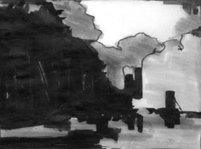
A four-value thumbnail in marker by Patti McNutt.
Our attraction to a subject may be based on a number of factors: the color, the light, an interesting element within the landscape, or a positive mental association to the place. But If we are to develop paintings with strong compositions, then we need to begin thinking in terms of simplified, abstract shapes — from the outset.
The most tried-and-true method for honing shape perception is the use of limited values. By restricting ourselves to just 2, 3, or 4 values, we find that simplified areas of value will conform to simplified shapes. For this reason, I encourage my students to work with limited values in all their preliminary studies and thumbnails.
The 4-value study
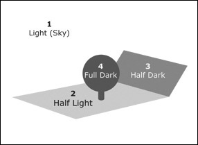 4-value study has the advantage of fitting nicely into the way values are typically expressed in the landscape. John F. Carlson in his classic Guide to Landscape Painting lays out his Theory of Angles. The theory says that major landscape elements — skies, trees, hills, ground — are on different planes. The angle of the plane in relation to the sun determines how much light it receives, which in turn determines its value. For example, the sky [1], being the light source, is almost always the lightest value. The flat ground [2], being directly under the sun, receives quit a bit of light, but is never as light as the sky. Other areas like hills [3] and trees [4], which are more upright, receive less light, and so are darker than the ground plane. Of course, these value divisions are not absolutes. There is some overlap among the divisions. See also Value Divisions in Landscape Painting.
The 2-value study (notan)
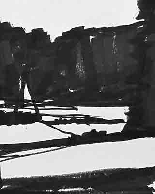
A strict black-and-white notan study, marker on paper.
Notan is a Japanese word that means “light-dark” balance. It expresses the most elemental aspect of a composition through an ultra-limited 2-value study. Because it is so design- and pattern-oriented, the notan is very good at representing the composition in its most basic, irreducible shape-terms. With just two values, however, the notan cannot reliably report on all the values in a subject, like a 3 or 4 value study can. Instead, it reveals more about the underlying design and structure that is the foundation of the composition. In all the years I have been studying composition, I have found no exercise that gets at the essence of a composition better than a notan study. The notan can be a little difficult to work with initially, because it is so unlike how we are accustomed to rendering images, but it is well worth the time to experiment with.
For a full introduction to notan, see The Wisdom of Notan – A Brief Introduction and Video Lesson: Exploring Composition through Shape and Notan.
The 3-value study
It is remarkable how much can be conveyed with so few values. The fewer values one uses to describe the landscape, the more shape-oriented the composition becomes.
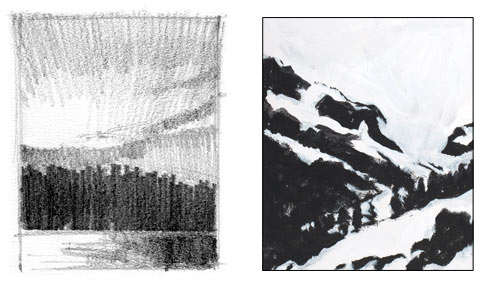
Left, my pencil sketch converts a sunset into its component masses using only three values — black, the white of the paper, and an intermediate gray. Right, a notan study in acrylic by Julia Campbell finds a beautiful arrangement of shapes through pattern and design.
Designing with Shapes
While shapes are the building blocks of a composition, the composition will only be effective if those shapes relate to each other in interesting and dynamic ways. Variation is the key. Here is a brief overview of the factors I consider as I develop my composition.
- Compositions that are made up of just a few major shapes project greater power than those made up of innumerable parts and details. A limited value scheme will encourage shape definition, but it is also helpful to think in terms of a limited number of shapes. For example, imagine that your composition is like a child’s picture puzzle, with just three to seven pieces. Each piece is a different shape, a different size, and a different color or value. When I am looking through my viewfinder and doing thumbnails, I select compositions that have no more than three to seven major shapes. This is not a rigid rule, but a guideline to help me stay out of trouble. (Of course, there may be many more than seven shapes in a given painting. But any lesser or minor shapes, such as details or individual strokes, will remain subordinate to the major shapes. Minor notes will work better, and not distract from the essential thrust of the composition, if they remain subordinate to the larger masses. Another way of saying it: the details, colors, and subtle value differences are contained within the major masses.)
- Some shapes are dominant; some are recessive. A few shapes might be the same size, but aim for as much difference between them as possible. The variation among the size of the shapes adds dynamism and interest to the composition.
- Pay attention to the distribution of lights and darks. (The notan is particularly good for making this assessment.) A good composition features different proportions of light and dark. Compositions of all-light, all-dark, or all mid-values are not as interesting as compositions with variation.
- A good composition allows our eye to apprehend the composition at once, without having to sort through too many parts and pieces.
- A good composition creates an emotional response that can be felt at a gut level. This is what we strive for.
In praise of the humble thumbnail
When does all this thought about the arrangement of shapes occur? At the very start, of course. The thumbnail study is a vital first step that is all too often overlooked. The earliest stages of a painting is when you should spend the most time exploring compositional considerations, not at the end when it will be much harder to correct. Right, a 4-value thumbnail done in marker by Patti McNutt.
Plein air painters often use a viewfinder to help define their composition, which is an important step, but nothing compares to an actual drawing or painted sketch. A thumbnail in 2, 3, or 4 values forces you to see the shapes that will make up your composition in a very direct way. It is also a great warmup to the painting process. Some of the nicest plein air paintings I’ve ever done were small 3 or 4 inch sketches.
 The point of a thumbnail is not to simply “test draw” the subject. It is meant to be a way to explore compositional options.
- Thumbnails should be done with a broad, bold tool like a broad-nib marker, a brush, or a soft (dark) thick-lead pencil that will make a positive mark. Don’t use ultra-fine point markers or light, thin pencils — they encourage you to think in a linear fashion, which is the opposite kind of thinking you want in a compositional study. Try a bold marker or a brush; these tools force you to think in larger shapes. The thumbnail sketch at right was done with a brush. It uses a some color, but is essentially a 2-value notan study.
- Keep thumbnails or preparatory studies very small. Larger studies take up too much time. And the size of the marks you make in a small study will tend to be bolder and more direct.
- Think of your thumbnails as disposable. Don’t make them precious. Try anything. The quicker, bolder and simpler they are, the more likely they will capture the essential shape-energy of the composition.
Using the compositional study as the foundation for the painting
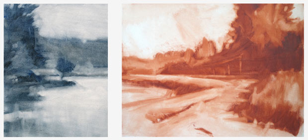
Once we have a thumbnail that we are happy with, then we can begin the actual painting. If we’ve done our homework, a shape-oriented study has helped us find a good composition. There is no reason to abandon that now. Therefore, I recommend starting a painting with the same direct, shape-oriented approach. The modified underpainting method is the best way I’ve found to do this. (See below.) An underpainting is a monochromatic (single pigment color) version of the painting that establishes the composition, value relationships and drawing before getting too involved with color. Composition first, color second.
Additional Resources
Landscape Painting: Essential Concepts and Techniques for Plein Air and Studio Practice
A detailed step-by-step explanation of the underpainting process is featured on on pages 132–139.
Value Divisions in Landscape Painting
The Wisdom of Notan – A Brief Introduction
Video Lesson: Exploring Composition through Shape and Notan
Painting Exercises: Limited Focus, Shape, Color and Notan in Studio Landscape

5 Comments
Mitch taught my beginning drawing class last winter, and we were limited to five values in our charcoal drawings. It was really useful. I’m working on a painting now in which I’m going through a more involved process than ever before, including a four-value “posterized” study. First I did a little pencil sketch of a cabin and woodpile, then a detailed pencil drawing. I thought I was finished with the subject, but not long ago I decided it was a good subject for a larger painting. So I started with a value study on gessoed paper in raw umber and solvent in four values. It looked good, so I carefully put a line drawing on the canvas with charcoal. Once the shapes were correct, I went over the lines with a fine-point permanent marker. After that, I tried a wipe-out underpainting in raw umber and solvent, using four values, a more precise version of the poster study, carefully following the lines. Now I’m working on a monochromatic underpainting in raw umber and white using a full range of values. Later I’ll do the overpainting with color. Such a formal process. I hope the painting will look really polished.
Thanks Mitch. The value of this process was seen when I was outdoors painting with a group. I did a couple of quick thumbnails and then the value study. It began to rain so we had to quit, but I was further along than anyone in the group. The others had only drawn a bunch of lines and were beginning to color them in when the rain hit. I was able to take a few photos, and then finish the work indoors, since the basic shapes were there and only needed a little color to have a pretty complete painting.
Thanks for this piece Mitch. Painting isn’t my medium (photography is) but I always find your instruction useful for my work.
Thank you for this very helpful, very specific lesson on the importance of great composition and how to achieve it. And I appreciate your simple and clear explanation of Carlson’s Theory of Angles. His book is not an easy read.
The Fairbanks Watercolor Society spent our Labor Day Paint-out Weekend at Healy, Alaska (just near McKinley Park). As it happened, I took the Carlson book you mentioned, and another artist took your book. They were both very helpful and it was exciting to read them both. I was particularly struck by the simplicity and strength of some of your examples. I am just about to to purchase your book for myself. Thanks for writing, gathering examples and publishing it.