


Mitchell Albala, Mountain in Sunlight, oil on panel, 12 x 12 inches. Collection of Michael Stasinos.
Many years ago, I had a dream about an upcoming exhibit: I was in the gallery … all the pieces were hung. The paintings in the dream, though, were not the actual paintings I had produced for the show. (Dreams can be funny that way.) But there was one painting in the dream that called to me: a single mountain in sunlight. Radiant and glowing.
The dream painting was so close to what I aspired to do in my own painting that I had to try painting what I saw in the dream. This would be new for me. I typically don’t work from memory or try to invent my subjects. I usually begin with an idea found directly in nature or captured in one of my photographs. The challenge of conveying an illusion of sunlight was not new to me. I had been enamored with this idea since my college days and my studies of Impressionism. But now, inspired by the glowing mountain in my dream, I wanted to see if I could push this illusion further than I had before.

Mitchell Albala, I Dreamed of Sun, oil on panel, 11 x 11 inches. The sky is a light yellow-green, leaning more toward yellow. The middle-ground and foreground includes cadmium yellows, ranging from medium to deep, and a tiny bit of cadmium orange.
I promptly went out and purchased a tube of “gold” oil paint. Not an unreasonable solution, but let’s just say this didn’t work as planned. (It would be several more years before I started experimenting with painting on a gold gesso ground.) Instead, I decided to try a strategy involving highly saturated color. I knew from my studies of Impressionism that saturated colors, when set to mid-value (neither too dark nor too light), could be an effective metaphor for light. This metaphor can also be achieved with strong value contrasts, but this was never much interest to me. Strong value contrasts would disrupt the sense of atmosphere that was so much a part of my vision. To my eye, lighter values, even for the shadows, feel more like light. (Also see How Value is Used to Heighten the Effect of Color in Landscape Painting.
I Dreamed of Sun sits on a wall in my studio. When visitors come, I tell them it is one of my favorite paintings of all time. They are always a little perplexed. They stare at it in silence. “What is it?” they ask. I urge them to keep looking. Usually, in less than a minute, they begin to see the mountain. For me, the painting expresses all my core interests: atmosphere, unified light, abstraction, and an illusion of bright light.
I see now that the dream offered a glimpse into the place I was wanting to go with my painting. In the years that followed, I did several more paintings using this strategy of suggesting light with mid-value, highly saturated colors, as opposed to strong value contrasts.
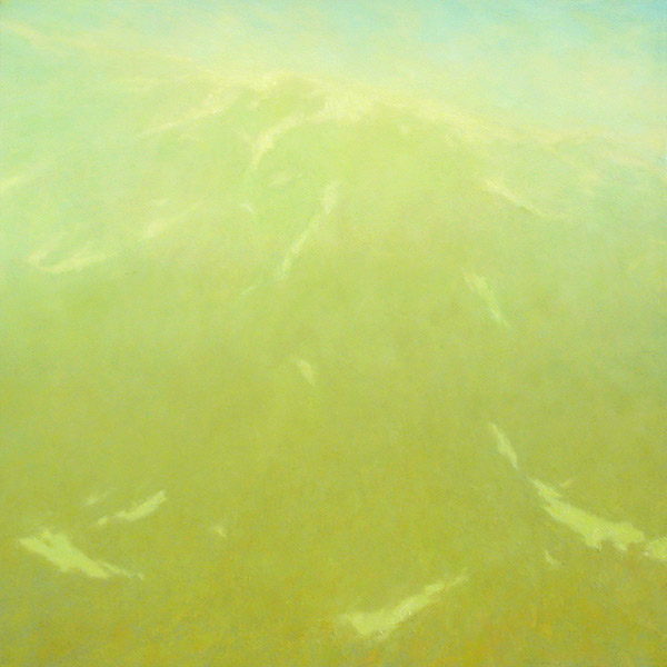
Mitchell Albala, Yakutat, Mid Morning, oil on canvas, 30 x 30 inches. This painting from my Sunlight & Snow series is one of my earliest efforts at working with value and color in this way. Here, the effect of mist and atmosphere also contributes to a diffuse, glaring light.
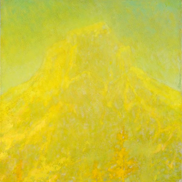
Mitchell Albala, Border Peak in Sunlight, oil on panel, 12 x 12 inches. Value contrasts are almost entirely abandoned in favor of bright, saturated colors, modulated primarily with subtle hue and temperature differences. My hope is that the sensations evoked by the saturated colors serve as a metaphor or stand-in for brilliant light.
Illusion, of course, is the operative word. A painter can never truly capture the effect of light with paint and canvas. It is simply not possible. That is the paradox that landscape painters are continually confronted with. Like the alchemist, who seeks to turn lead into gold, so too does the painter strive to make paint and canvas impart to the viewer something that is equal in spirit to true light — knowing full well that such alchemy is the stuff of dreams.
Additional Resources
from Landscape Painting: Essential Concepts and Techniques for Plein Air and Studio Practice
Local color vs. perceived color, page 107
How Value Effects Color Identity, pages 114–119
from The Landscape Painter’s Workbook
Mountain in Sunlight, page 90
Color Priority, page 123
Exercise: Color- and Value-Priority, Side by Side, page 134
The Affect of Value on Color Identity in Impressionist Painting
How Value is Used to Heighten the Effects of Color in Landscape Painitng
Part 3: In Sunlight – Beyond Value with “Border Peak in Sunlight”
6 Comments
Thank you, Mitch, for this in depth explanation of values, colors, light and vision and how they gnaw at the painter, coming at you even in your dreams.
Mitch, I usually associate romanticism with violent movement and dark turgid light, but you have a new take … sunlit romanticism! Glowing, sensitive and beneficent. Every Pacific Northwest household needs one of your paintings to help get us through our gloomy winter.
You are helping to see beyond the represented scene to what I wish to see and convey in my painting: the afterglow when I look away. I’m not there yet at all, but getting better at seeing.