 Works by Ben Aronson, Sue Charles, Kris Ekstrand, Kim English, Robin Weiss, and Mitchell Albala demonstrate that the key to “capturing” light is a delicate balance between value and color.
In every landscape painting workshop I teach, I ask everyone, “What is the painting about?” I want them to describe the aesthetic qualities they are most interested in, such as movement, depth, or color. Just about everyone’s answer includes the word “light.”
This isn’t surprising. The qualities of natural light — its luminosity, its range, its brilliance — are what draws many painters to landscape in the first place. However, “capturing” light, as we often call it, can be quite challenging. It isn’t simply a matter of copying what we see. We have to be very clever about how we handle the balance between value and color. In this post, I’d like to explore approaches to capturing light used by six different painters.
- Light Through Value Alone – Kris Ekstrand
- Value Priority Light – Ben Aronson
- Color Priority Light – Mitchell Albala
- Color and Value Priority Transitional – Robin Weiss
- White as a Stand-In for Light – Kim English
- Gold as a Metaphor of Light – Sue Charles
The Painter’s Light — a Function of Value and Color
There are only two means at our disposal for creating an illusion of light — value and color. Value is the relative lightness or darkness of a color. Color includes attributes like hue, temperature, intensity, and value. Value can exist independent of color, as in a drawing, but color cannot exist independent of value, because value is one of the attributes of a color.
To create an illusion of light, painters learn to manipulate value and color in clever ways. So clever, in fact, that they can produce paintings that, although never matching the luminosity of natural light, may evoke similar sensations. If any of the great painters of light — J.M.W. Turner, the Impressionists, or the Hudson River painters, to name a few — were able to convince us that their light was “true,” then that is a testament to how clever and skillful their use of color and value was.
Light Through Value Alone
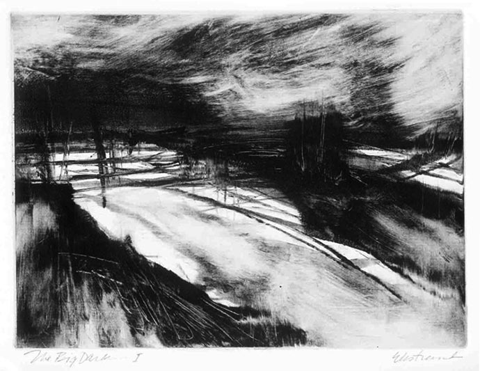
Kris Ekstrand, 2019, The Big Dark, monotype, 21 x 24 inches
The Big Dark achieves a strong sense of light without using any color at all. This demonstrates an important, if somewhat obvious point: although value contrasts are essential for suggesting light, color is not.
See more of Kris Ekstand’s work.
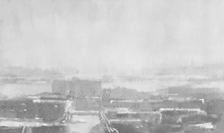
Value Priority Light
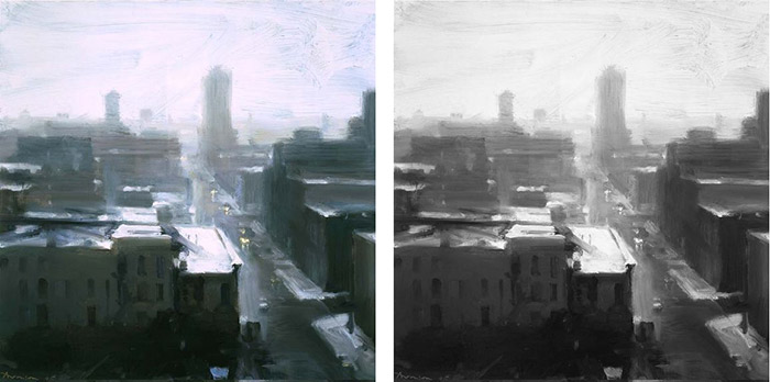
Ben Aronson, Chicago in Snow, 2005, oil on panel, 12 x 12 inches
In Aronson’s piece, the illusion of light is achieved largely through strong value contrasts. Color plays a role — the pink light that glances off the rooftops adds an additional layer of interest to the painting — yet value contrast remains the primary driver of light. We could say that value is about 85% responsible for the effect of the light, while color is 15% responsible. We can demonstrate this by converting the painting to black-and-white and placing it alongside the original. Very little is lost in the translation. The color adds something to the overall impression, but it has a lesser priority than the value contrasts.
See more of Ben Aronson’s work.
Additional examples of this approach can be found at my Pinterest board: Color – Value Priority.
Color Priority Light
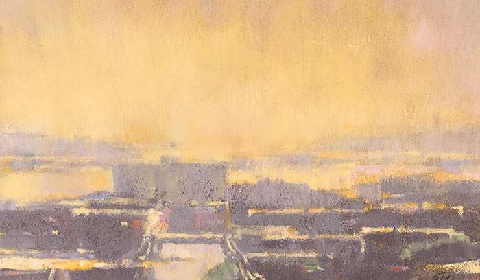
Mitchell Albala, September Light, Salmon Bay, pastel on paper, 5½ x 9 inches.
The color priority approach to light is typically found in classic and contemporary Impressionism. In September Light value contrasts are minimized, which in turn allows color contrasts to become the main event. Colors are not extremely light in value (like white) or very dark (like black). Hovering in the mid-value range, they hold more of their intrinsic color identity and can therefore act as color. There is a gentle complementary relationship between the warm orange-yellow sky and the cool gray-violet ground. When September Light is converted to black-and-white (below), the painting doesn’t hold up very well. In black-and-white, the color contrasts that were the main driver of the sensation of light are lost. In this example, the balance of color and value is the opposite of what we see in Aronson’s example. Here color contrasts are 80% responsible for the illusion of light, while value is only 20% responsible.
Also see The Affect of Value on Color Identity in Impressionist Painting.
Additional examples of this approach can be found at my Contemporary Impressionism board at Pinterest.
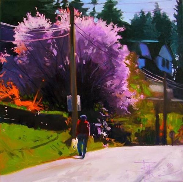
Color and Value Priority Transitional
Robin Weiss, 2005, Spring Day, oil, 12 x12 inches
There is a third approach that I see as a combination of value priority and color priority. In Weiss’ bold strategy, we find richly saturated colors surrounded by extremely dark values. This turns out to be a reliable means of suggesting brilliant light.
See more of Robin Weiss’ work.
Additional examples of this approach can be found at my Pinterest board: Color and Value Priority Transitional.
White as a Stand-In for Intense Light
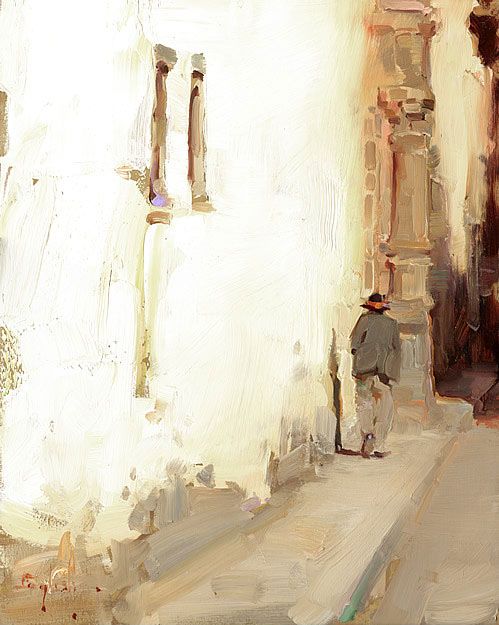
Kim English, Walls of Cusco
Pure white is often used to impart an impression of brilliant light. We frequently see this in the works of watercolor painters who leave the white of the paper exposed. There’s nothing lighter in value than white. Generally, the impression of white as light can be heightened by placing it alongside strong darks. Yet here, English creates an astonishing level of brilliance without the use of strong value contrasts or adding a lot of color to the white of the wall. “The small but very important cast shadow from the figure, as well as the shadow in the background, tells us the direction and intensity of the light,” says Kim. “Also, keeping the lights warm helps to convey the feeling of sunshine.”
See more of Kim English’s work.
Gold as a Metaphor of Light
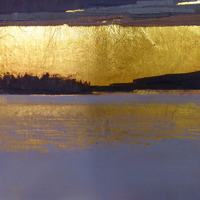
Sue Charles, Silent Night, oil on 23K gilded wood panel, 6 x 6 inches
The approach to suggesting light used by Sue Charles is very different from what we see in the previous examples. By using gold leaf to represent areas that are “light,” she suggests glare and luminosity by reflecting actual light back to the viewer’s eye. Value contrasts are also important with this strategy. The rich darks of the upper cloud, the land mass, and the violet water below help accentuate the gold. It also helps that the gold’s natural yellow hue is the color of actual sunlight. Sue says, “I have always been interested in why people like shiny things so much, and only recently found a scientific paper that supported my hunch that it may be based on our absolute imperative to find water in the environment.”
See more of Sue Charles’ work.
Related blog post: Gold Gesso Ground as a Metaphor of Light in Landscape Painting.
4 Comments
Such great information! I have your book and am re-reading it.
Thank you.
Thank you for this blog. It helped me consolidate and organize what I knew about light in paintings. I am looking forward to my class with you in July about Strategies for coordinating color in a landscape.
Thanks, Karen. A re-read is good from time to time. Even having TWO copies, one for you bedside and one for your studio! 🙂
Thanks, Adena. I am looking forward to the July color strategies workshop as well. You’ll find material in the workshop that was not covered in my book.