

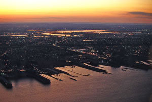
 In the mid 1980s, when the Twin Towers were still young, I did a series of paintings inspired by the spectacular views from the observation deck. The 10th anniversary of 9/11 seems like an appropriate time to present these paintings — only one of which has been shown before; the others have lain dormant for 28 years. It is strange to consider that these views, unlike so many other views, are no more. Certainly there are other scenes like them, perhaps from the top of the Empire State Building or the Freedom Tower, but these views are now memories, hovering high above lower Manhattan like ghosts.
Upon seeing these pieces, another landscape painter observed, “I can SO see you in these.” Even 28 years ago my interest in abstraction, creating a unified light, and exploring paint texture was clearly evident. What was of particular interest to me in this series were the abstract patterns created by the docks jutting into the water. That, coupled with an interest in a unified overall light, was my goal for the series.
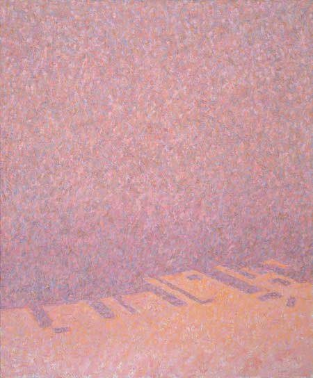
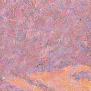 Above: Jersey Shore, 1983, oil on canvas, 29″ x 24″ inches. Even as far back as 1983, at the start of my painting career, I was interested in surface and the tactility of paint. At that time I handled texture in a very methodical and deliberate manner. Left: I would apply carefully controlled and fairly regular-sized strokes to each pass of color. As compared to paintings of the last decade, this earlier approach (also seen in Manhattan Bridge, below) was more mechanical and did not allow for much spontaneity. That isn’t to say that my brushwork today is a completely spontaneous and slap-dab affair. It isn’t. The mark-making is always considered and thoughtful. But today I use a greater variation of texture and much less regularity which is, to my eye, more organic. (For example, see the Ballard Bridge painting in the Ethereality – Clouds + Fog portfolio.) That said, the previous, more mechanical approach to texture and broken color was still able to hold the color of the light within a unified veil of atmosphere, like an image projected onto a screen.
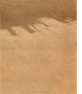
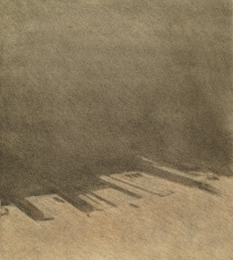
Above: Jersey City Water, 1983, pastel on paper, 14″ x12.5″; Jersey City Sky, charcoal on paper, 1983, 12″ x 10″. These two drawings served as compositional studies for Jersey Shore. An important choice I had to make was whether the painting would be land-dominant or sky-dominant. I felt that Jersey City Water, with more area devoted to the water, gave the impression of looking down; while Jersey City Sky, with more devoted to the sky, felt more spatial and drew my eye outward and into the sky.
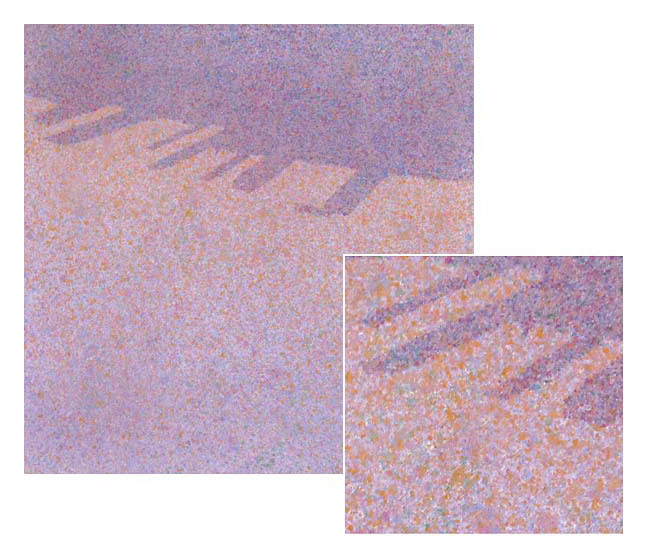
Above: Jersey Shore Study, 1983, acrylic on canvas, 14″ x 14″. My interest in broken color led me to experiment with a pointillist approach. I hoped to achieve the same veil of light by using more regular-sized dots or strokes as opposed to thick, texturized strokes. (Each dot or point was not applied individually! I created a mask for the shore line and then used a brush splatter technique.)
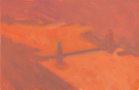
Manhattan Bridge Study, 1983, acrylic on paper, 9″ x 14″. This was one of nearly a dozen color studies I did for this piece, trying to find the right color relationship between the land and water (the positive and negative shapes).
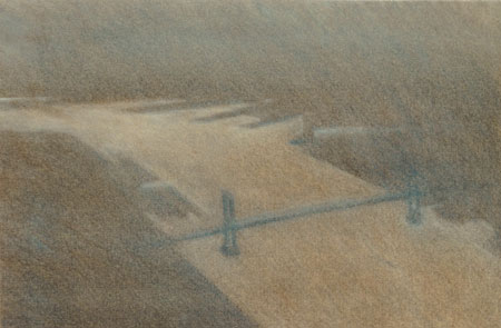
Manhattan Bridge Study, 1983, charcoal and pastel on paper, 9″ x 13.5″
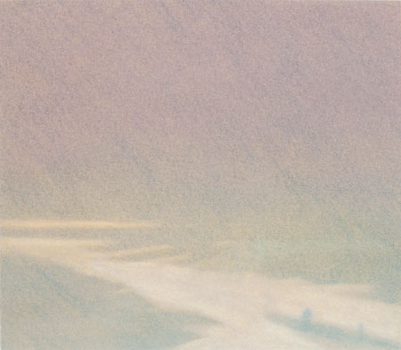
Bend in the River , 1983, pastel on paper, 8″ x 9″
4 Comments
Mitch,
I just love the oranges and pinks in the Manhattan Bridge..the blending of these 2 colors through the painting really creates tremendous interest to the viewer..
Mitchell, Your observations,your articulation and careful showing of your thought processes are wonderful. I look forward to receiving more … and always end up wishing you had workshops on the east coast. Thanks, Dona
These are beautiful Mitch. It is great to see work from the start of your career. My have you grown! I’m particularly drawn to the Jersey Shore series. They are haunting and mysterious – much like memories. I wish I knew about these before we sent out our newsletter; I would have liked to have included them in memoriam. Next time! 😉
It’s a pleasure to keep up with you — past work and present.