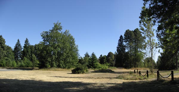
The first compositional move any painter makes is to apply a limited focus. Whether it’s a still life, an interior, a figure, or a landscape (which is the most all-inclusive of subjects), some portion of what we see must be excluded if we are to create a focused, effective composition. As Hans Hoffman put it, we must “eliminate the unnecessary so that the necessary may speak.”
A limited focus is explored through the “picture window” — the imaginary window we impose around a subject. That window will ultimately define the boundaries of the composition and correspond to what will become the edges of the painting or drawing. When artists peer through a viewfinder or cropping device, or look through the camera, they are, in effect, testing various picture windows and possible compositions.
Applying a limited focus is actually a very flexible way of exploring composition. When we take control of the picture window — deciding where the top, bottom, left and right edges of the picture fall — we discover that there is not just one composition that can be extracted from a scene, but many. In the following demonstration, I will extract three compositions from the larger scene.


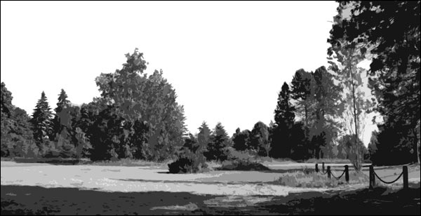
Color may be the main event for landscape painters, but it can sometimes distract us from seeing the foundational shapes and values. The first thing I did was to convert the image to black and white. (I also applied a filter in Photoshop to limit the number of values and simplify the shapes.)
Next, I generate three different compositions from the same area of the scene. Slight changes in the position of the picture window create noticeable shifts in how the eye moves through the composition. Note that the proportions of each composition are not the same. The picture window is flexible, so I am not bound by standard proportions such as 8 x 10, 9 x 12, 16 x 20, etc. I can give the composition what it needs by contracting and expanding the picture window at the top, bottom, left or right edges.

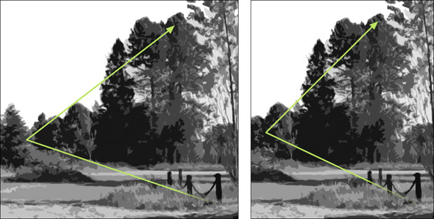
GOOD: Options 1 and 2
Some movements in composition are direct, meaning that our eye follows a contiguous edge, line, or contour. Implied or indirect movement, on the other hand, doesn’t follow visible contour or edges, but is created as the eye makes connections between different spots within the picture, in a connect-the-dots fashion.
Options 1 and 2 use the same implied diagonal movement: we enter in the lower right along the diagonal perspective of the fence posts; we follow it to the left, and then zig back ti the right along the implied diagonal formed by the tops of the trees. The two compositions are nearly identical, except that option 1 features more real estate to the left — which changes everything. It creates a wide “landscape” format which naturally suggests expansion from left to right. We still track the diagonal movement from the lower right to the left and back again, but our eye seems to travel a greater distance. In Option 2, we experience these same diagonal movements, but in a more compressed way. The vertical format reinforces this. The vertical or portrait format is less common in landscape painting, but with certain scenes, it can be very effective in drawing the viewer inward and upward to create a sense of deep space.
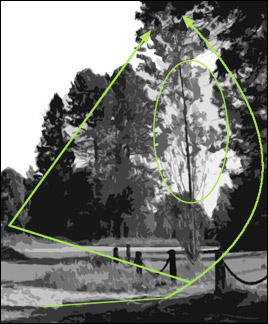
 BETTER: Option 3: This composition is the most successful of the three. It explores the same portion of the scene as options 1 and 2, but adds some circular movement.
1. By including a little more of the ground plane at the bottom, a dark cast shadow is introduced. This serves as a stepping stone into the composition. It connects to the largest fence post, which connects to the tall dark tree on the right to form a semicircle of dark (see arcing arrow).
2. The tall dark tree on the right, the cast shadow in the foreground, and the dark trees on the left make for three strong, varying shapes of dark value. More variation of shapes means more a interesting composition.
3. A light opening between the trees (see oval) now becomes a shape unto itself. It is surrounded by many darker values, and provides another way to move through the space.
4. A clear foreground mid-ground, and background is a tried and true way of staging the landscape space. It is not an absolute requirement that every composition use all three stages, but in this case the changes introduced in option 3 do establish all three layers, which helps create a deeper space.
Additional Resources
The Landscape Painter’s Workbook: Essential Studies in Shape, Composition, and Color
Chapter 2, The Picture Window and its Format
Movement: Animating the Composition, page 63
Landscape Painting: Essential Concepts and Techniques for Plein Air and Studio Practice
Composition Through the Picture Window, page 85
Limited Focus Through Selection, pages 86–87
The Viewfinder, page 89
The Flexible Picture Window, page 89
Composition Before Color — Considerations in the First Phases of Plein Air Painting

11 Comments
“The mediocre teacher tells. The good teacher explains. The superior teacher demonstrates. The great teacher inspires.” – William Ward
Thank you for another lesson in seeing. Do you have workshops on the East Coast?
Thank you! I’ve been laying out photos on the floor, or pasting to a wall, then sketching in pencil/charcoal and then pastel and watercolor, until something feels right. Then I end up painting something very different! Having a stronger sense of chosing and rearranging elements the the right composition – in gesture and color, as well as passion, will help!
A very good exercise. Here in big sky Montana, narrowing down the landscape to a manageable scene can be difficult when we are in awe of what we see. Thanks.
Mitchell, your concept of reducing to black and white first is a great aid. Reality shows us that there is actually a lot of grayed colours in and about us, allowing the purer colours to really sing. Thanks for your explanations.
Darrell, your comment raises a very good point about color theory — that bright, saturated color is often more effective when it is augmented by neutrals. The bright colors will seem that much brighter when they are alongside neutral or duller colors. In my book, I devote a whole section of the color chapter to “Naturalistic and Expressive Color.” However, in this exercise, my reason for converting the image to back and white was not so much to analyze color issues; rather, to make seeing basic shapes and values more obvious. Here, color can actually be a distraction. From a perceptual standpoint, I believe it is easier to “see” these mysterious and elusive compositional energies if we reduce our shapes to black, white and gray. This isn’t to say that color will never be a factor in composition; of course it will. But when evaluating a composition, anything we can do to help us see simplified shapes and values is always a good idea.
Nice article and demo. A good supplement to your book is Ian Roberts’ book “Mastering Composition.” My issue at times is that the last century of painting has negated the idea of spatial painting [Renaissance space) in favor of the [flatness] of the two dimensional canvas. Can we design landscape space that focuses on the flat picture plane instead worrying about depth? … This past century has made it difficult for artists because anything goes. But, what will be remembered 100 years from now? What is worth doing? Isn’t art about taking traditions and then adding your own individual flavor to them to create something personal and unique?
Stan, you are a philosopher indeed! I took the liberty of shortening your comment for the benefit of readers, but you do raise some good questions that artists often think about. To answer your first question: “Can we design landscape space that focuses on the flat picture plane instead worrying about depth?” Absolutely. As you rightly point out, many traditions have preceded us and given us license to paint any way we want. The only word of caution I would offer about trying to paint flat is this: just as a painting intended to be dimensional can appear flat, so too can a painting intended to be flat miss the mark and appear dimensional! In answer to your closing thought, “Isn’t art about taking traditions and then adding your own individual flavor to them to create something personal and unique?” Again, I would say, “Absolutely!” We stand on the shoulders of those who preceded us and there is no escaping that. Ultimately, the artist must follow their bliss … their interests … their passions. If they do, they are being creatively honest, which is why we call them artists.
Mitch,
This is an excellent demo. The obvious question is why did you photograph the entire space when what you subsequently found of interest was all on the right side of the area that you originally decided was of interest. For me, I often experience a scene that excites me enough to take a photo as totally different in the photo. So I will suggest that what you saw as a possible painting, the whole photo, didn’t translate as a photo into good composition. This has happened to me enough that I don’t presume I have framed a target painting properly in say a telephoto scene and I make sure I take a non-telephoto shot and get other information around that scene as well, taking more than one photo. That way if my presumption of the edges of the scene don’t prove out, I will have the info required to adjust. Second, your arrows emphasize the compositional flow of darks. But there is also potential for the painting to easily have a good circular flow of lights which gives that composition extra points in my book.
Good observations, Gerry. The reason I photographed the entire space (and featured it that way in the article) was to underscore the idea of limited focus. (It was not that I thought the photo as shot would would be a good composition.) I wanted to show readers that what we actually focus on in a painting is a very small slice of the 360-degree pie. I also agree with you, that taking more than one photograph of a scene, or taking a “non-telephoto” shot is always a good idea. I want extra real estate so I can explore compositional options (as I did in this exercise). You can always crop away some extraneous material, but you can’t get it back if it’s not in the photo!
Got your book. Love your book. Thank you for the above explanation about making a focal point in your painting. I had another composition question. In your book on page 92 you mention composing with a grid. I have found someone who teaches how to compose artwork using a grid of the armiture of golden rectangles. I was wondering what you think about this tool to compose artwork and if your ever use it. Thank you very much for all the great content you provide on your blog and the recent reference to the Gamblin site for his article on “Getting the White Right”.
This is a great question, Linda. I wrote about the 3 x 3 grid in the book because it is a relatively easy way to lend balance and structure, which I sometimes find helpful. I say “sometimes” because I believe these types of grids should be used when they are helpful — and abandoned when they are not. Although there are many compositional principles with which we all need to become fluent, composition is also an intuitive act. The grid can sometimes interfere with an open-ended and intuitive response if we try to adhere to it too closely. For that reason, I find the golden rectangle too restrictive and never use it. This isn’t to say that it isn’t a sound strategy or can’t be effective. It is simply not a strategy that fits into my way of thinking about composition.