 When we consider the remarkable way the Impressionists were able to capture the illusion of natural light, the single word that undoubtedly comes to mind is color. Much of the attention on Impressionist color theory centers on their use of brighter, more saturated colors. This was an essential part of their overall strategy; however, it worked in large part because of the way they controlled the values of those colors. More specifically, they were keenly aware that the relative value of a color profoundly affects its chromatic identity.
How Value Affects Chromatic Identity
What is chromatic identity? Chromatic identity simply is the degree to which a color’s innate hue quality is apparent. For example, we can imagine a patch of blue that has only the faintest hint of blue in it. It’s hue identity would not be considered strong. Now imagine a patch of blue that very strong and intense. The hue identity of that blue patch is much greater.
When colors become extremely dark or extremely light, their chromatic identity becomes much less apparent. For example, if a shadow is made very dark, it will read primarily as a dark value and little of its intrinsic color identity will show through. Similarly, an extremely light or nearly white passage also has much less color identity.
A color’s full personality is expressed when its value is neither too dark nor too light, but when it is in the middle range. Extremely light or extremely dark colors reveal less of their intrinsic hue; therefore, how dark or light a color is will affect how much we can perceive the color as actual color.

Extremes of value profoundly affect a color’s ability to be perceived as actual color. In the 9-step value scale (above), colors on the left are very light in value, nearly white, with only the smallest amount of color present. Colors on the right are very dark in value, nearly black, and little of their intrinsic hue is visible. If you squint at the chart, the colors in the middle zone appear most brilliant and seem to come forward. There seems to be more “color” in this region. This demonstrates a fundamental truth about color: a color’s full chromatic identity is expressed when its value is neither too dark nor too light, but somewhere in the middle range.

Meindert Hobemma, Village with Water Mill Among Tress, c.1665
Color-priority and value-priority systems
The effects of value on color identity can be seen in paintings that use a “value-priority” or “color-priority” system. A value-priority system relies primarily on exaggerated value contrasts to create the illusion of light and evoke a sense of drama. This approach was used to great effect by the old masters of chiaroscuro (from the Italian “dark-light”), like Rembrandt and Caravaggio. In the landscape tradition, the Dutch landscapists of the seventeenth century employed a similar strategy. Color was not absent in their works, but strong value contrasts and drama clearly took priority over color.
The Impressionists also wanted to be faithful to their experience of light and color, but they believed that pure color was a better metaphor for the intensity of light than strong value contrasts were. They began a shift toward a color-priority system. They were able to retain greater coloristic identity by keeping more of their colors in the middle range, neither too dark nor too light. This allowed the colors to show more of the color identity. More saturated colors evoked sensations that felt more like real light. What’s more, color contrasts like complementary pairings and temperature differences could be heightened. In the Salon-driven, academic style of France in the mid 1800s, this was a radical breakthrough.
A value- or color-priority system is not an either-or proposition. It exists on a continuum. A painter’s color solution may lean toward color, or value, or some combination of the two — but color and value will always have a reciprocal relationship.
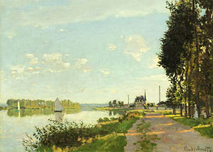
We can see the effect of value on color identity by looking at two paintings by Claude Monet, painted nearly 30 years apart: Argenteuil from 1867 and Rouen Cathedral, West Façade, Sunlight from 1894. By seeing the paintings in both color and black-and white, we are able to see how much the illusion of light is dependent on value and how much on color. Value contrasts are not absent in these examples, or in Impressionist paintings in general. Value relationships always play an important role in defining the structure of a painting, but the Impressionists were never afraid to let brighter color take priority over value contrasts in service to the brilliance of sunlight.
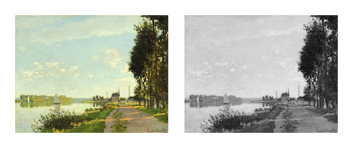
Claude Monet, 1867, Argenteuil, oil on canvas, 22.4 x 31.5 in. Courtesy National Gallery of Art.
Argenteuil might be considered a transitional piece. Monet uses lighter values in the shadows and more saturated colors than his academic contemporaries, but it is not as color-prioritized as his later works. When converted to black-and-white, the color is obviously lost, but the overall value structure is strong enough that the black-and-white version can hold up on its own.
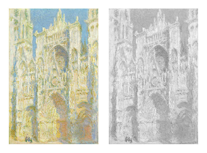
Claude Monet, Rouen Cathedral, West Façade, Sunlight, 1894, 39.4 x 25.9 in. Courtesy National Gallery of Art.
Much more is lost in the conversion to black-and-white in Rouen Cathedral than in Argenteuil. When the color is removed, the painting becomes a ghost of its former self. Most of what makes the painting work is lost because the contrasts are based primarily on color, not value. Argenteuil is based perhaps 40 percent on color and 60 percent on value, while Rouen Cathedral is based about 80 percent on color and 20 percent on value. In Rouen the colors are valued closer to the middle range, allowing them to keep more of their coloristic identity and react with each other in more chromatic ways. In direct sun, the shadows on a façade like this would likely have had much greater contrast. But Monet opts to express that contrast not with value but with a delicately balanced relationship based on temperature and complements. The overall effect is greater luminosity.
What value can achieve through contrast, color can achieve through chromatic identity.
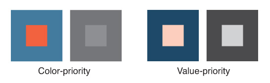
The difference between color-priority and value-priority can be seen outside the context of a painting, as in these simple color swatches. The first pair of swatches demonstrates color-priority: the vibration seen in the orange and blue complementary swatch is achieved entirely through color contrast. When that same swatch is converted to black-and-white we see that the values of those two colors are nearly identical; the contrast holds no reaction outside the context of color. The value-priority solution also features an orange-blue complement. However, because the orange is so light and the blue so dark, they hold much less chromatic identity and have little of the reactive quality we see in the color-priority pairing. In the value-priority pairing, the color and black-and-white swatches have almost the same potency.
Additional Resources
Landscape Painting: Essential Concepts and Techniques for Plein Air and Studio Practice
How Value Effects Color Identity, pages 114–117
Playing Studio Detective with a Film of Monet Painting at Giverny
Jerry Fresia: On Painting the Sun: Monet’s Choice”
How to Suggest Brilliant Light Using Saturated Colors Instead of Strong Values Contrasts
4 Comments
Another great reminder that the modern masters could really “push paint.” A lesson I hope to retain in my own plein air painting.
Bravo, Mitch! Thanks for this clear and insightful description. Now I get it.
I like the way you are differentiating … what is fascinating to me is that, even though “Rouen” depends on color, the subtle value shifts still describe the light. Yes, the colors create a luminosity, but even in subtlety, value persists in describing form. As I explore painting with a higher key palette, I still rely on my value studies to guide my choices in color. Happily, I have spent the last month painting in Italy and Germany and now return back to the beloved Northwest. Talk about differences in light!
so clearly explained! it is very rare to find information on technique that goes into such important detail. a typical description of impressionist painting will simply refer to “broken-colour”, without explaining how they actually used this to such great effect.
this was really helpful!