
Marz Doerflinger, 5:30 PM, pastel on paper, 6 x 8″.
Landscape painters strive to capture a particular time of day or color of light — sunny or cloudy, sunrise or sunset, early morning or late afternoon. But what about the colors of night? From a painter’s perspective, the nocturne presents a special challenge. Without the sun as a powerful light source, contrasts are significantly reduced and values become much darker.
What color strategy can a painter use for the nocturne? In this post, I’ll review several dusk and nighttime paintings, and then, at the end, list seven specific strategies for painting the nocturne. Be sure to
Dusk
Before night, there is dusk — that fleeting time after the sun drops below the horizon, when everything is bathed in deep, rich blues. This moment is captured in the the two painting below, Rooftops 59th Street and Cascade Dusk.
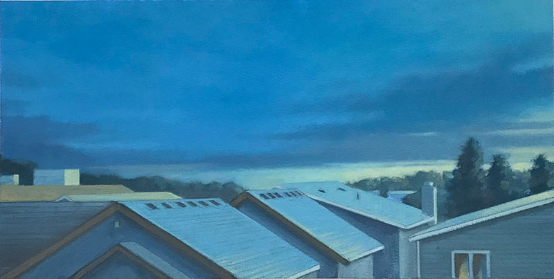
Rooftops 59th Street, Cobalt Dusk , oil on paper, 7″ x 14″
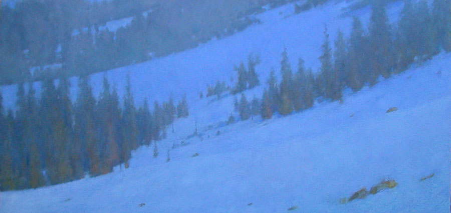
Cascade Dusk, oil on canvas, 20″ x 38″
Colors in the Dark
To fully understand the color requirements of the nocturne, we have to recognize an important truth about color and light.
The darker a color is, the less color or “hue identity” can be perceived within that color. At least some light is needed to reveal a color’s intrinsic hue.
When you are in a very dark room at night, a red sofa or a green wall will hardly register as red or green. You cannot perceive the individual hue of those objects, only their values. This is because of the physiology of our eye. Our eye has two kinds of photoreceptors. The cones provide vision in brighter light, and are responsible for distinguishing color and fine detail. The rods handle vision in low light, but are not able to distinguish color. So when viewing subjects in low-light conditions, we are not able to discern much color.
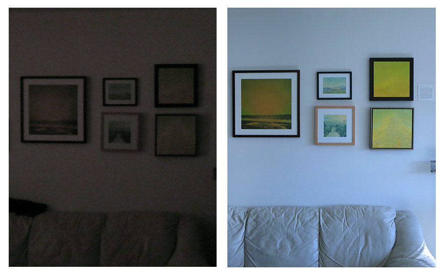
In the left photo, above, taken at night, colors are indiscernible. This is because our eyes do not perceive color in very low-light conditions. Once light enters the scene (even partial light, as shown in the right photo), we are able to make out the individual hues in each painting.
To paint a nocturne, therefore, the painter must be willing to modify colors and values in three ways:
- Make the values lighter than they would actually be at night
- Exaggerate the value contrasts slightly, to replace what is lost in the absence of a strong light source
- Add more color than is actually seen in the dark — especially colors in the blue and blue-green families
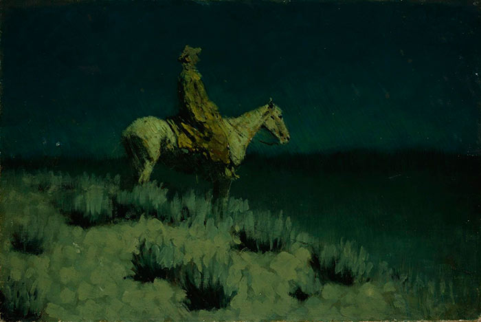
Frederick Remington – Blue and Green Makes Night
When I first tried painting nocturnes over a decade ago, I found inspiration in Frederick Remington’s nocturnes of the American West. I observed a common color thread in his paintings: he not only relied heavily on blues and rich black-like colors, as one might expect, but he also used a great deal of blue-greens and greens. These color families are particularly effective as suggesting the colors of night.
In both of the examples below, Remington shifts the lights toward green. Perhaps a moonlit night in the West actually produces such colors, but more likely, Remington is performing perceptual sleight of hand with his colors. He is exaggerating or modifying the colors in such a way that the they make a more effective statement about the color of night than the colors he actually saw.
There is also a scientific explanation as to why we respond well to greens in a nocturne. The Purkinje shift notes that although our eyes can hardly perceive color in the dark, they are more sensitive to green wavelengths. James Gurney, in his book Color and Light, goes into this more in the section called Is Moonlight Blue?
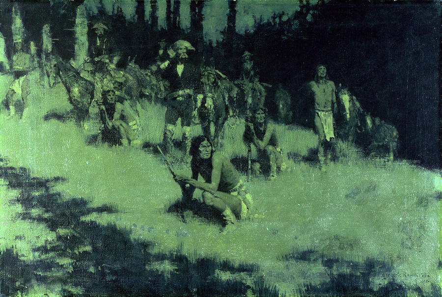
Frederick Remington, Apache Scouts, Listening
Frederick Remington, Untitled, (The Night Rider, The Night Herder ) 12″ x 18″
James McNeil Whister
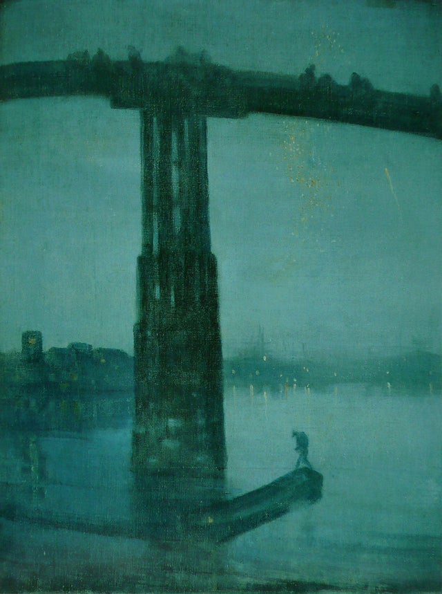
James McNeil Whister, Nocturne: Blue and Gold – Old Battersea Bridge
Blue-green is also the color strategy chosen by Whister for Nocturne: Blue and Gold – Old Battersea Bridge. Note the strong value contrast between the bridge and the sky. Did Whistler record the value contrasts he observed, or did he exaggerate them to bring out the design?
Marz Doerflinger
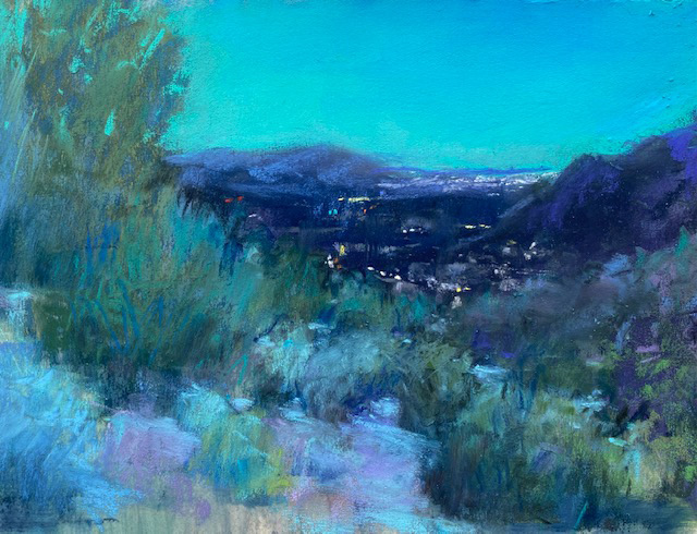
Marz Doerflinger, 5:30 PM, pastel on paper, 6″ x 8″.
In working out a strategy for the nocturne, Marz explains, “The low light reduces the value contrasts greatly, so I have to rely more on variations of color saturation.” Also notice how the sky is the most saturated color in the painting. The sky often sets the color tone of the painting and makes a night scene glow.
Bill Cramer
In Cramer’s nocturne, the patterns of light and shadow are still present, but much narrower in value than they would be in daylight.
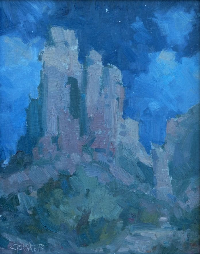
Bill Cramer, Still of the Night, 2014, oil, 12″ x 9″. Private collection.
Nocturne Color Strategies
- Hue families – In my experience, the most important color strategy for the nocturne is the use of cooler colors; in particular, blues and blue-greens. We may not necessarily observe these colors in the actual scene, but in a painting, they are particularly effective at suggesting the colors of night. Review my nocturne board at Pinterest, and you’ll see how may paintings rely on this color set.
- Pigment options – To create the blues and blue-greens that are so effective in the nocturne, painters turn to colors like phthalo blue, phthalo green, turquoise blue, Prussian blue, and ultramarine blue. Of course, these colors are all very intense pigments and will need to be desaturated for the nocturne.
- Color saturation – The saturation levels of the colors should not be too high or too low. If saturation is too high, the scene will look unnatural. (Only full sunlight can produce intense colors like that.) If the colors are are too low in saturation, they will read as gray and not convey the blue and blue-green hue character that is so essential to the nocturne.
- Values – Because light levels are so low at night, the range between light and dark is narrowed. Values contrasts are significantly diminished. So we will often need to heighten the value differences, at least to some degree.
- Skies – In daylight painting, the biggest value contrast usually occurs between the land and the sky. This is the case in the nocturne, as well. Occasionally, however, the sky can be darker than the land-based elements, as we see in Remington’s The Night Rider, above. The difference in value between the sky and the land is one place where the night is less stingy with its value contrasts, so use it to your advantage. If the sky is lighter in value than the land-based elements, (as in Doerflinger’s painting), its deep blue or blue-green color is a good way bring luminosity to the painting.
- Moonlight – Many nocturnes are moonlight paintings. Although moonlight is 450,000 times less bright that the sun, it does offer a tiny bit more light than than a moonless night. So painters will use the moon as their light source, and exaggerate its effects.
ADDITIONAL RESOURCES
See more nocturne examples at my nocturne board at Pinterest.
FEATURED PAINTERS
Marz Doerflinger: marzdoerflinger.com
Bill Cramer: billcramerstudio.com
4 Comments
Very well written . Would you contrast noctures vs.
tonalist paintings if not too time consuming for you.
Enjoyed your well written nocturne observations.
Would you kindly contrast them with Tonalist paintings.
Thank you.
A nocturne is a painting targeted to a very specific time of day. Tonalism is a much broader idea, really an approach to color and mood. Tonalists do often paint sunrises and sunsets, and nocturnes, but tonalism refers more to how they choose to paint these subjects. Tonalist painters rarely dip into saturated colors; instead, their palettes are laden with earth tones and neutral colors. Tonalism isn’t necessarily about a specific time of day, as the nocturne is. For a great explanation on the “harmony of neutrals”, as found in tonalist paintings, see my blog post: The Harmony of Neutrals.
It’s interesting to look at photo images of moonlit landscapes that are taken using long exposure times, especially those images that don’t actually include the moon, to get a feel for the color saturation of the land features and foliage and the values of sky, land and moving water.