
Detail, “September Light, Salmon Bay” urban landscape painting by Mitchell Albala
The longer I work with color, the more I become convinced that most of the time, most of the color color in my landscape paintings painting are not the colors I observe in nature — or in my photos. As a landscape painter, my goal is not to replicate the colors I see, but to interpret the colors. I alter colors and devise clever strategies that, while never matching the luminosity of natural light, can evoke similar sensations.
September Light, Salmon Bay is part of my ongoing Azure & Asphalt series. In this post, I’ll outline each phase of the painting’s development to show how one can stretch beyond the colors (and composition) presented in the photo.
 SOURCE. Photos are a helpful visual aid, but they can mislead us in significant ways. You may not be able to tell from this photo, but it was shot looking directly toward the sunset. There was an enormous amount of glare and warm yellow light infiltrating the entire scene. Under the camera’s unfaithful eye, however, all that warmth is lost. All that remains is an analogous blue-gray harmony. It lacks the type of color contrast that can make a painting sing. To make this something that is uniquely my own, I have to think outside the proverbial color box.
 PHOTOSHOPPED IMAGE. When working from a reference photos, I typically modify the picture with various Photoshop filters. This breaks down the complexity of the image, simplifies the shapes and suggests how the picture might appear in painted form. Large amounts of fine detail dissolve. What’s left are the basic patterns of light and dark that will serve as the foundation of the composition. I’ve also departed from the photo in other ways. The composition now has more asymmetry. The vertical street is no longer in the center; the large building that divides the river is off to the left; the river itself is divided into two unequal shapes; and there is more area devoted to the sky than the land. Also see Improving Landscape Composition with Perspective Cues and Land- or Sky-Dominant Cropping. Neither the photo nor this modified image suggests the color I am after; that’s something I’ll work out in the color study.
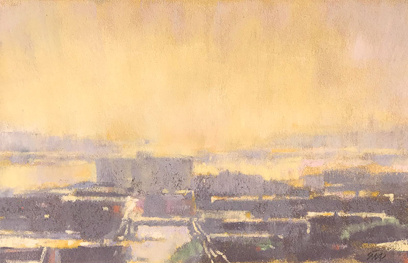
Study, September Light, Salmon Bay, pastel on paper, 5-½ x 9 inches. Collection on Donna Dumont.
COLOR STUDY. I never begin a painting without a color study. In this piece I wanted to see how a warm and intense yellow sky would play against neutral gray-violet land masses. Handled loosely and in pastel, this study also allows me to test the balance between detail and simplified shapes. In detailed urban scenes like this, I have to include enough visual cues to make it clear that it is an urban landscape, but few enough that it doesn’t distract from my primary interest, which are the patterns of light and color. Striking this delicate balance is what I call the the art of implication.
 PRELIMINARY DRAWING. I begin most paintings by blocking in large masses of tone and color. But in this painting, which relies on careful drawing, I take the necessary time to plot out the placement of the major shapes.
 INITIAL COLOR BLOCK IN. With a good drawing to guide me, I lay-in the large color and value masses. This establishes the abstract patterns of the streets and rooftops, and the yellow-violet complementary relationship between the sky and foreground. The painting doesn’t yet suggest much depth; I still need to develop the color and edges further.
 CLOSE TO FINISH. The color moves closer to what I am after. But to my eye, the edges of the rooftops and highlights are feeling a bit too sharp.

Mitchell Albala, September Light, Salmon Bay, 2019, oil on panel, 12 x 20″. Available.
FINAL. I’ve modeled the sky more carefully, for a smoother overall effect. I’ve softened the edges throughout, which helps achieve a slightly hazy effect. And I’ve darkened some of the violet-gray values, which allows the small yellow-orange accents to pop more.
Related blog posts
Landscape Composition: Building Interest through Intervals and Variation
New Work in Azure and Asphalt: “Warm Horizon” and the Art of Implication
Getting the Light Right: The Power of the Color Study
5 Comments
Thank you for posting. Did you use oil or acrylic to lay down the yellow ground?
Although I have done that from time to time, in this case, I laid that initial yellow tone down with oil and let it dry before drawing over it.
I loved this blog post. Thanks for sharing. Learned a lot. All best. Laurie
Thank you. I really like the way you simplified your explanations of how you made your decisions in each step. I learned a lot from this.
“Enlightening” demo, Mitch. I’ll pass it along to my students, some of whom may not already subscribe to your blog.