Excerpted from Chapter 3, Composition in Action, in The Landscape Painter’s Workbook: Essential Studies in Shape, Composition, and Color.
 THE LANDSCAPE PAINTER’S WORKBOOK:
Order now
U.S.: Amazon | B&N | Book-a-Million | IndieBound | Bookshop.org
United Kingdom: Amazon | Waterstones | Book Depository | Books etc. | Bookshop.org
Canada: Amazon | Indigo
Australia: Booktopia
Negative space is typically defined as the area in between or around the “positive” elements of a subject. In figurative or still life painting, for instance, the negative space is usually the space behind the subject, in the background. In landscape, the sky comes closest to behaving in this way, sitting like a vast backdrop behind all the land-based elements. However, there are other large spaces in landscape composition that behave similarly, such as large bodies of water, fields, or empty streets that advance toward the viewer. These are not negative spaces in the traditional sense—they are “positive” forms—but because they are so large and often uniformly colored, they effectively behave like negative spaces.
If these areas are not properly activated — if they are treated like “empty” spaces — they won’t feel like a fully integrated part of the composition. We never want one part of the painting to feel separate from any other part. Negative spaces can be activated in several ways.
- Varying the color and/or value within the negative space
- Dividing the negative space into smaller portions (closed negative space)
- Adding spatial cues to the negative space, such as clouds in the sky, furrows in a field, or reflections in the water.
Activating Skies with Color and Tonal Variation
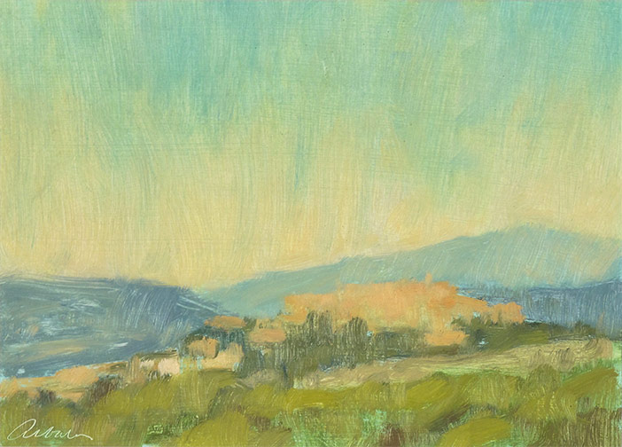
Mitchell Albala, Montegabbione, Umbria, oil on paper, 5″ x 7″ , 13 x 18 cm
How do we activate a cloudless sky so it becomes more than just an empty blue backdrop? In the original Montegabbione painting (above), the sky has a noticeable shift in hue, temperature, and value. This activates the sky and gives it more dimension than if it were evenly toned — which is what we see in the modified version (below). When the color and tonal variation is stripped out, it appears flat and less interesting. As a general rule of thumb, painting a sky as a flat, unvarying color should be avoided.

Activating Skies with Closed Negative Space
Skies can also be activated by using closed negative space. When parts of the subject — such as a tree, a telephone pole, or a rooftop — touch or nearly touch the edge of the painting, it breaks up the negative space into segments. Two or three segments of negative space is more visually interesting than a single space. Here Castagnet allows the uppermost corner of the building to touch the top edge, dividing the sky into two major segments of different size. The telephone lines and street light break up the larger negative space even further.
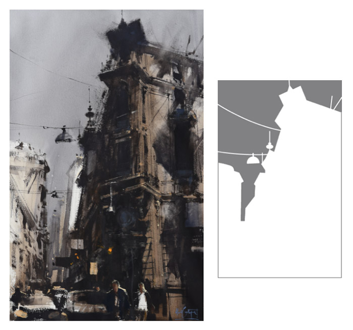
Alvaro Castagnet, Montevideo Urban Series, watercolor, 40″ x 26″, 101 x 67 cm
Activating the ground plane in the natural setting
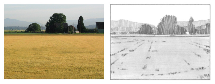 The dominant event in this subject is the field, but it lacks visual cues that carry the eye across the field and into the distance. By bringing out the subtle ground lines and furrows, and accentuating the linear perspective, the field becomes much more interesting. In some subjects, it is necessary to take existing cues and exaggerate them. In others, you may have to invent new cues. The trick is not to overdo it. A few accents or spatial cues can be enough to bring the negative space to life.
Activating the ground plane the urban setting
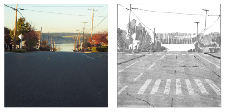 Roads that advance toward the viewer can offer a dramatic entry into a painting. In this scene, though, the negative space of the road is empty and appears to drop down at the bottom edge, like an upright plane. By adding perspective cues — cracks, a crosswalk, and white lines — the road becomes more active. It actually becomes as much a part of the composition as the upper portion. Note how the addition of the crosswalk raises the portion of the road closest to us so it no longer feels like an upright plane.
1 Comment
Greeting from Australia, Mitch. As a mere enthusiastic amateur, your first book was absolute magic and helped improve my paintings no end. Now I can’t wait until November to get my hands on this new books.